What's new

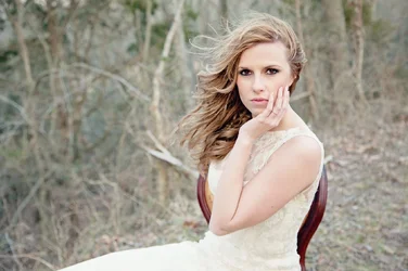
Some critique please.....

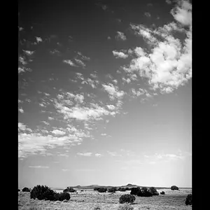
I love the original. There's room to breathe, and there's plenty of right to left visual motion across the frame so that the space to the left makes sense.

I do not like the placement of tones. It feels dull to me. This is a very small curves adjustment that I think improves the overall feel of the thing:

$foo.webp
 
I love the original. There's room to breathe, and there's plenty of right to left visual motion across the frame so that the space to the left makes sense.

I do not like the placement of tones. It feels dull to me. This is a very small curves adjustment that I think improves the overall feel of the thing:
what he said.
I love the concept.
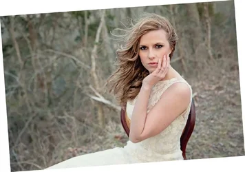
I think the landscape framing looks terrific.
I do think that she looks a bit washed out and fades a bit too much into the background.
Her arm is too bright.
She is too leaned back

$IMG_6404_edited-1llll.webp
 
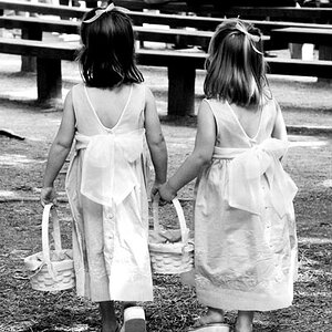
I honestly like the original. I think it looks whimsical. But that is because I have an extreme obsession with Alice in Wonderland. I think it is beautiful. But I sort of wish there was some more color in it. I also like the Black and white crop that 651stp posted. But I truly think that the pictures is beautifully fantastical. Yeah I said fantastical.
 
I love the original. There's room to breathe, and there's plenty of right to left visual motion across the frame so that the space to the left makes sense.

I do not like the placement of tones. It feels dull to me. This is a very small curves adjustment that I think improves the overall feel of the thing:

View attachment 38591


I I really like this edit! I think that takes away how dull it was! Beautiful!!!
 
So why the request for c+c, lol? Seems like you have it where you want it.

Ok smartass........he asked why I did what I did and I answered him. Even if I get a picture just the way I want it I still ask for critique because there will always be something I never notified. For example I never notified the white stick in this picture until the pointed it out. So.....if you don't want to be helpful please move on :)

wow, touchy much?


Just want things to stay on track and there is no need for comments like you made.
 
I love the original. There's room to breathe, and there's plenty of right to left visual motion across the frame so that the space to the left makes sense.

I do not like the placement of tones. It feels dull to me. This is a very small curves adjustment that I think improves the overall feel of the thing:

View attachment 38591
I love this edit! Could you explain what you did? I work mostly out of photoshop but still very naive to it.
 
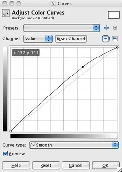
I airbrushed the branch with a hint of grey to push it down a bit, and then I did a curves adjustment:
$foo.webp

This isn't the exact curve I used, but it's pretty close. This tool is from GIMP, but I think photoshop has the concept of a curves adjustment which should work pretty much the same way.

The grey diagonal line down the center is how it starts out. The curved line above it is my adjusted curve. The way it works is this: Imagine all the possible values (brightnesses) placed along the bottom edge. Darkest, black, is on the left and lightest, white, is on the right. There's even a little gradient there to show you, see it?

The curve shows how to map each value to a new value. The new values are shown on the vertical axis, on the left edge of the square, where there's another gradient. To map any value, find it on the bottom edge. Go straight UP until you hit the curve, then go straight LEFT until you hit the left edge. This is the new value. The point of a curves adjustment is that photoshop (or GIMP) will automatically do this to ever pixel in the image.

The diagonal line just says to take any value and change it to... the same value. So, do nothing!

My curved line says to leave the darkest values alone, mostly, but as you get brighter, make them.. a little brighter. Then as you get brighter still, make them.. a little brighter than thatm and so on, until you get to about 2/3 of the way over (where the dot on my line is) then you reverse the trend. We're still brightening things up, but we're doing it less and less as we get up to the whitest whites. This particular curve basically brightens up the lighter midtones, but gently.

You can use different shaped curves to do different things -- make the darker values even darker and make the brighter values even brighter (more contrast) or vice versa, or whatever! The particular kind of curve I used seems to be to be pretty common amongst "pro" style work, it gives a nice light feeling that suits things like wedding photos and so on, and is in general pretty flattering to people.

Once you get the hang of curves adjustments, you'll be in there all day! Remember, though, like all adjustments, a light touch is what you want. Don't overdo it, less is more!

 

Create an account or login to comment

You must be a member in order to leave a comment

Create account

Create an account on our community. It's easy!

Log in

Already have an account? Log in here.

New Topics

Back
Top Bottom