What's new

Some fall pics, thoughts appreciated

dormfab

TPF Noob!
Joined
Apr 9, 2008
Messages
25
Reaction score
0
These are just a few of the pictures I took on a few different outings, but I thought they were the best out of the bunch. It would be appreciated if you could leave feedback letting me know what I did right and what needs improvement. Oh yeah, these were taken with a Canon A720. Thanks.

1.
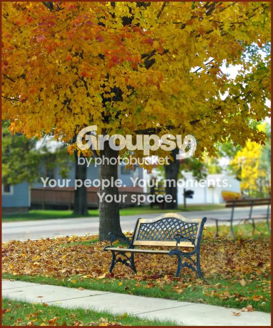
chairblur2.jpg


2.
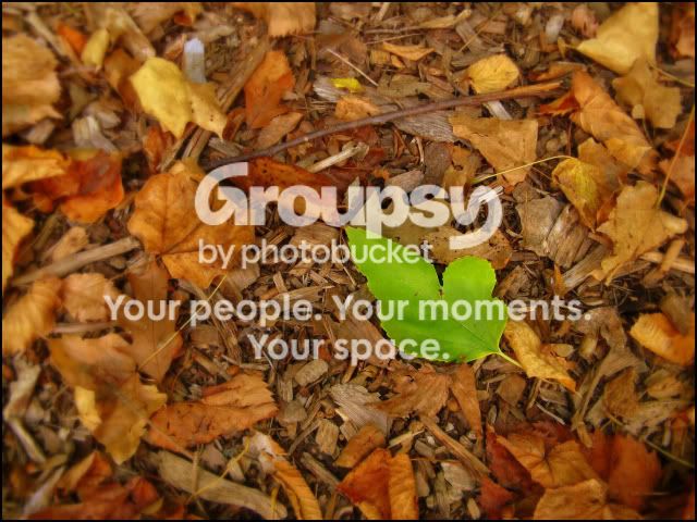
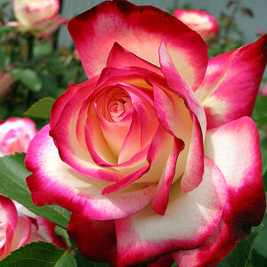
greenleaf2.jpg


3.
grass.jpg


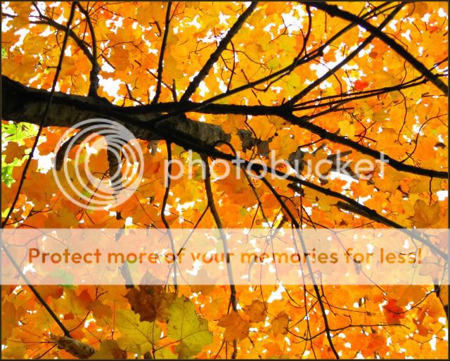
4. I posted this in the "Yellow assignment" thread, oh well
upredu.jpg
 
I like the first one the most. The difference in colours compliment each other imo. I like how the bench is there. It's still missing something though. Someone help me figure it out.

Got it. Someone sitting on the other bench(out of focus one). Black pants, red sweater, lol. With stripes?? No. That's lame.
 
I think that #4 is my favorite also. I do like the third one, I just think you may have been a couple of minutes too late to catch a little better color in the sky.


http://www.hnhstudios.com
 
Last edited:
2,3 are the two that do it for me, one is a picture of a bench and 4 is the underside of a tree, the other two make me feel something.
 
3 is really nice. Really nice. I might want to crop a bit differently ... take a bit off the right and perhaps the bottom (or move the lens were you to recompose it), but I think the colors and mood in this are great. EDIT: Actually none of the bottom... tbh I think I want the image to just be longer on the left hand side... not cropped, but more added to it.

4 is beautiful. I really love shots looking up into leaves. A lot of people seem to poo-poo these, but I like them a lot.

1 suffers from depth of field a bit. Looks like the tree trunk is in focus and the bench is not. I might have gone for a smaller aperature if possible on this one. Given you were at 1/125" at F4, you probably could have gone like 1/60th at F8 or something. I also might have cropped it a bit to toss the bench lower and to the right a hair... JUST a hair.

2 was conceptually neat but didn't do a ton for me just because the green leaf wasn't all that interesting in and of itself.
 
Thanks for the feedback all. I spotted #1 driving by and the bench looked inviting for some reason, so I took the picture trying to show that. When I got back to to take a look at it, I felt the background was too distracting so it was touched up accordingly in PS. #2, I think it was the contrast of the leaf's color that caught my eye, so thats what I tried to show. #3 I was taking a bunch of pictures of the grass trying to find something that worked, and #4 was an attempt to share the whole "holy **** the woods are really yellow" feeling.
 
I really like #2. (Life surrounded by death?)

I like #4, but would change the composition slightly. Right now the trunk is just running across the screen as part of the photo, breaking up the yellow canvas. I think I would try tilting the camera to get the tree coming out of a bottom corner, moving up in a diagonal towards the middle of the picture. Use that element of the tree to help your photo DRAW people into it.

Nice work though. We went to the mountains yesterday to try and capture some fall color, however we were a week or two too late. :(
 
#2 would definitely be my favourite, if you hadn't done that dodgy blurring round the outside. I would try a subtle vignette or something.
 

Create an account or login to comment

You must be a member in order to leave a comment

Create account

Create an account on our community. It's easy!

Log in

Already have an account? Log in here.

Back
Top Bottom