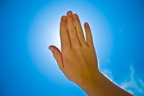
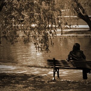
1st & 3rd are my favs. The 3rd would have worked better not centered as stated by samanax. #1 could use some editing on the brightness. Raise it a wee bit.
I think #1 might benefit from some alternative processing. It has a bit of a retro feel. Maybe cross-processing or an ambrotype? Or a cyanotype...hmm...(after bumping it up as Dylan noted)


![[No title]](/data/xfmg/thumbnail/42/42040-7a66cabbeffd44783ea44a91ef4d0e70.jpg?1619739987)