some.new.stuff.from.a.new.member. {LQQK}

AR3

TPF Noob!
Joined
May 13, 2007
Messages
5
Reaction score
0
Location
South Florida
Can others edit my Photos
Photos NOT OK to edit
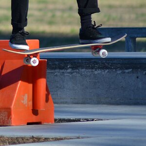
here.are.some.of.my.shots.

any.advice./opinions.?.i.appreciate.it.

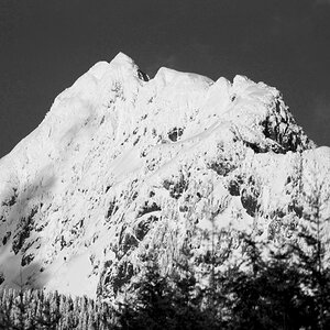
35mm.hand.developed.and.edited.in.darkroom.
4ztymxe.jpg

4v54hvt.jpg

4zohppk.jpg

52xb42c.jpg

53qrujm.jpg

4xyplp3.jpg


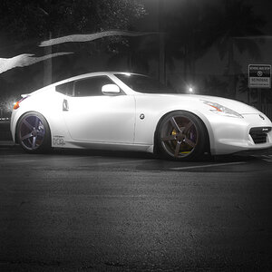
all.digital.and.ps.edited.

5253azn.jpg

4oz59qq.jpg

4kvuo2o.jpg

4qdxn5z.jpg

6as8cco

4vs7w20

62pcv1f.jpg

637cgok.jpg
 
Last one is my favorite, shouldn't have had such a close crop on the cologne bottle. Just my $.02
 
i.dont.know.if.i.want.to.reply.when.i.put.periods.in.arbitrarily.to.be.artistic.

;)
 
:lol:

i.need.some.feedback.!.. . . . . . . . . . ..

:D
 
Coming from one new guy to another, to me its about half and half. I see some good shots imo and then i also see some that just seem like snapshots. The ones that i do like are pretty good though, i like the one with the silver balls and the last one is good too. It seems like you will make great progress as i hope to also. Keep up the good work!
 
thanks.but.can.you.be.more.specific....

why.a.certain.photo.is.effective.while.the.other.
lacks/sucks? .....
 
AR, welcome.
Please try hardest not to alienate people on here by your way of writing.
Write like we all do.
Please.


Personally, I don't like the colour manipulations and colourful frames at all.
The lone shoe looks accidental.
The reflecting balls (second photo?) are nicely captured, so is the bottle of Cologne, but I also strongly feel that you cropped in too closely and better shouldn't have lost the top and bottom.
I also quite like the lines and overall composition of what I think is Photo 5 --- one tip: if you post as many photos as you did now, do make sure there are a) SPACES between them, and that b) your photos are numbered.

And re-think your way of writing... friendly advice.
 
maybe his spacebar is broken.....
 
Yes, maybe. And the Q key has moved over to where the O is and all...
 
To my opinion your colour shots are very Kitsch, specialy with these borders
and B&W have a deficient composition and without composition B&W shots are not attractive.

Your picture look like the results of afunny game, but if you had a good time that s already a good point ;)
 
I will switch up the writing :p

A funny game? I really dont know what you mean?

The contrast and composition isn't that bad is it?
 
Overall, a good selection of varied shots :)

They are really a case of "something for everyone" some will agree on what they like and others wont.

the one thing that comes across here though, is your imagination... your trying out different ideas, and thats a good thing.

Keep up the good work ;)
 
Well, if critique is what ye wants, critique is what ye gets....

1: Don't like the soft focus and the composition is off.....whats the subject of the photo, the stone pillar or the water fountain? You see what I mean?

2: Decent composition and exposure. Its by far the best of the lot.

3: Not a good crop and black and white does not do this subject justice. To flat tonaly.

4: Good focus and ok composition, but the subject is a bit boring and again, there is a lack of good tone.

5: Focus and compositionok.....but again, boring subject.

6: Good focus......but here we have a) lack of a good tonal range, b) no definitive subject, c) a bit busy and d) boring subject.

7: Bad focus, poor composition, boring subject.

8: Same as above

9: As Lafoto said.....looks incidental

10, 11, 12, 13: Colors don't do anything for me, and they all lack a good subject. 11 might work without the color and if you get down closer to the ground to get that "disappearing" look.

14: Not bad compositionally and subeject wise.....still a tad on the boring side, but not as bad as the others. Biggest problem is the can top is too hot.

Is that the kind of critique you wanted? :mrgreen: ;)

Brian
 
i dont know if i am the only one but i like the sneakers on the stove top, very abstract.
 

Most reactions

Back
Top