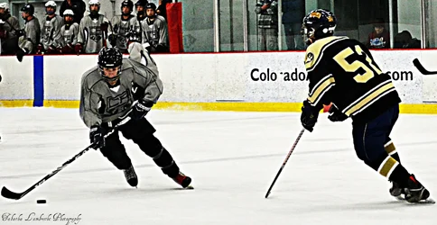
The content is outstanding. The first has a problem of visual confusion where the helmet of the fellow on the right blends with the stuff in the background outside the boards. Otherwise these are excellent.
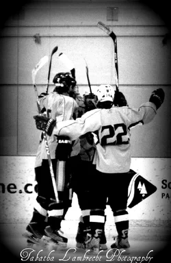
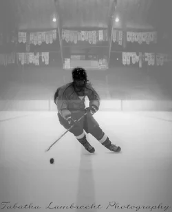
The processing you've applied is, as has been noted, a bit over the top. I kind of like the high contrast/popped colors look for these. They look like newspaper photographs of last night's game. The soft/misty look isn't working for me, I feel that's not a look that fits well with the feel of hockey, whereas the high contrast/high drama looks do. The vignettes are a bit much, you're going for a vintage look which is fine, but even the oldest cameras didn't vignette like THAT.
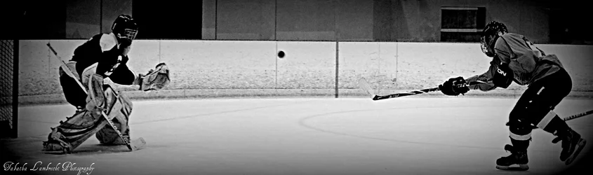
The penalty shot photograph, #2, is astonishing. Well done. You have a fine sense of timing, whether at the game or while editing photos later, it doesn't matter. Ease off the instagram effects, and you'll really have something.
Based on the content here, I suspect that your profile might be exaggerating your newness just a bit.



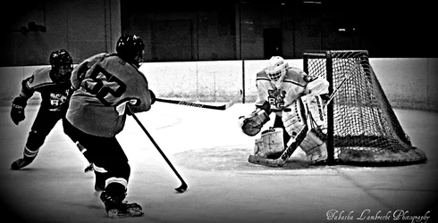
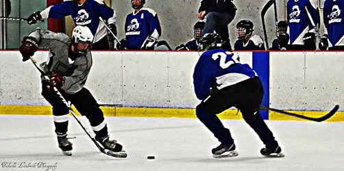
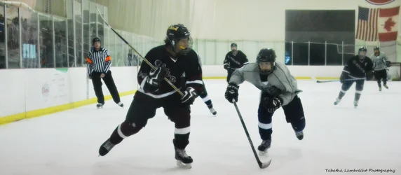
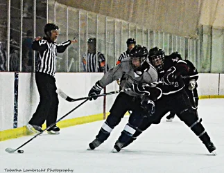
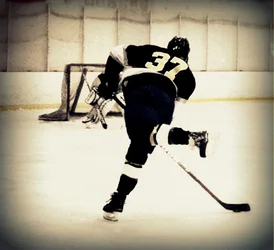


 I want to be a sports photographer so bad when I get older. I agree, these photos are the newest hockey photos that I have but they are almost a year old. My camera broke around a year ago and I just bought a new one yesterday. So now that I have really looked at these photos I see that they have way to many instagram like affects on them. I am looking forward to shooting a football game on Friday night and I will put those pictures up, so I would love to get some critiques on those when they are put up. Thank you guys for all the thoughts and comments, it means a lot.


![[No title]](/data/xfmg/thumbnail/42/42026-4f14b406e4eb9c886f454721fb021fba.jpg?1734176410)

![[No title]](/data/xfmg/thumbnail/42/42024-bf0604d67b26c7acb5e4d59254692618.jpg?1734176407)
![[No title]](/data/xfmg/thumbnail/32/32941-f21147be61c00828a23d6ce011d840eb.jpg?1734162763)