C&C per req:
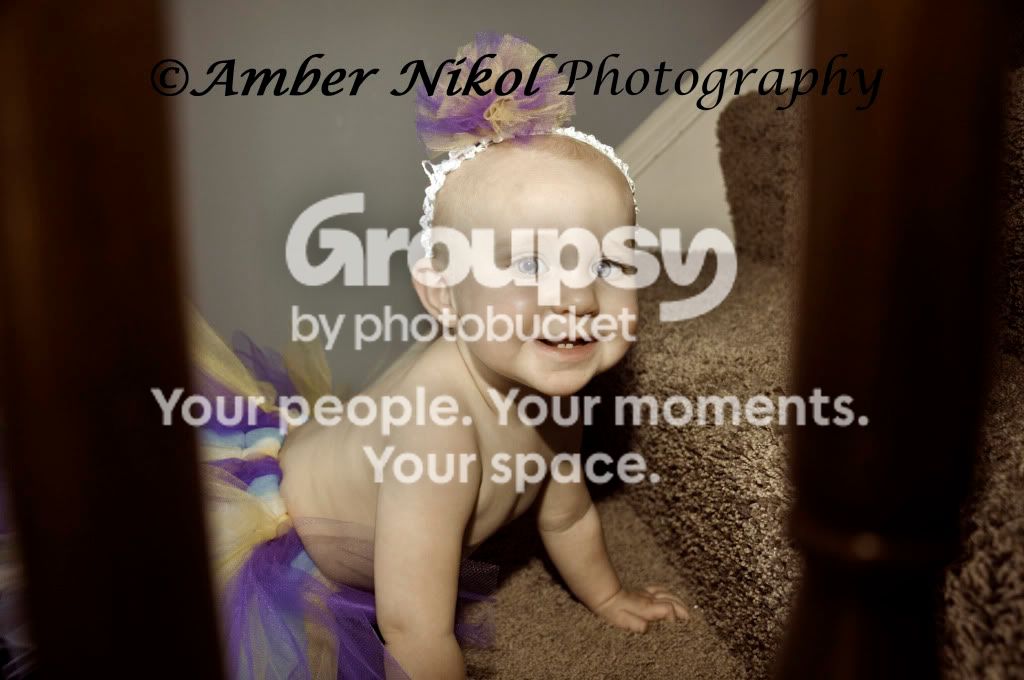
1. Cute; good exposure. I would suggest a longer focal length and/or larger aperture (smaller f#) in order to decrease DoF render the background less softly focused. At the same time, you must watch your point of focus as it was insufficient to keep the whole child sharp. Watch your composition; cropping limbs is fine if you must, but do it boldly and never bisect a joint or leave little bits. The right leg is fine, the toes of the left, not so much.
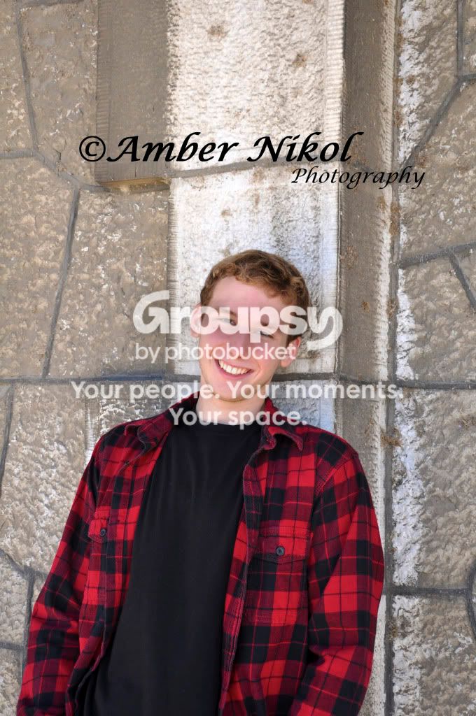
2. Another cute shot, but holy white-balance batman. The poor child looks like they were drowned in a cafe-latte! Your best bet is to shoot WB Auto and RAW so you have the most lattitude for correction in post. I would suggest cropping this one a little more such that the posts are the edges of the image. If you're going to use on-camera flash for this sort of image, consider a diffuser; even something as simple as a bit of thin tissue draped over the flash tube will help immensely in reducign harsh shadows and hot-spots.
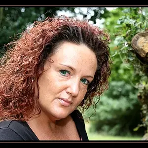
3. Very nicely framed and exposed, but it seems that you have missed the focus. The point of focus appears to be the necklace/chain rather than her face eyes.
4. Rather boring in comparison to the above. Technically it's fine, but I would crop most of the empty space above in order to make the subject less centered in the image.
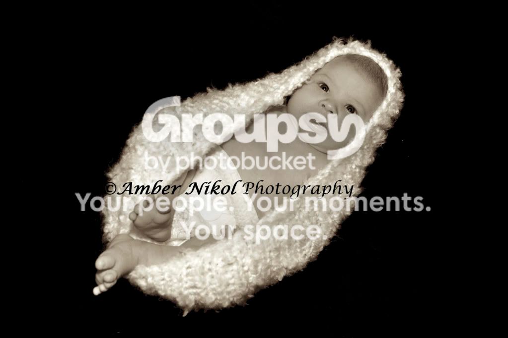
5. This one has a pecululiar look; almost as it was shot with very long glass. The child's face and torso seem almost one dimensional. I'm not fond of the sepia-esque treatment. Colour or a nice crips B&W would have made this stronger I think.
Just my $00.02 worth - your mileage may vary.
~John