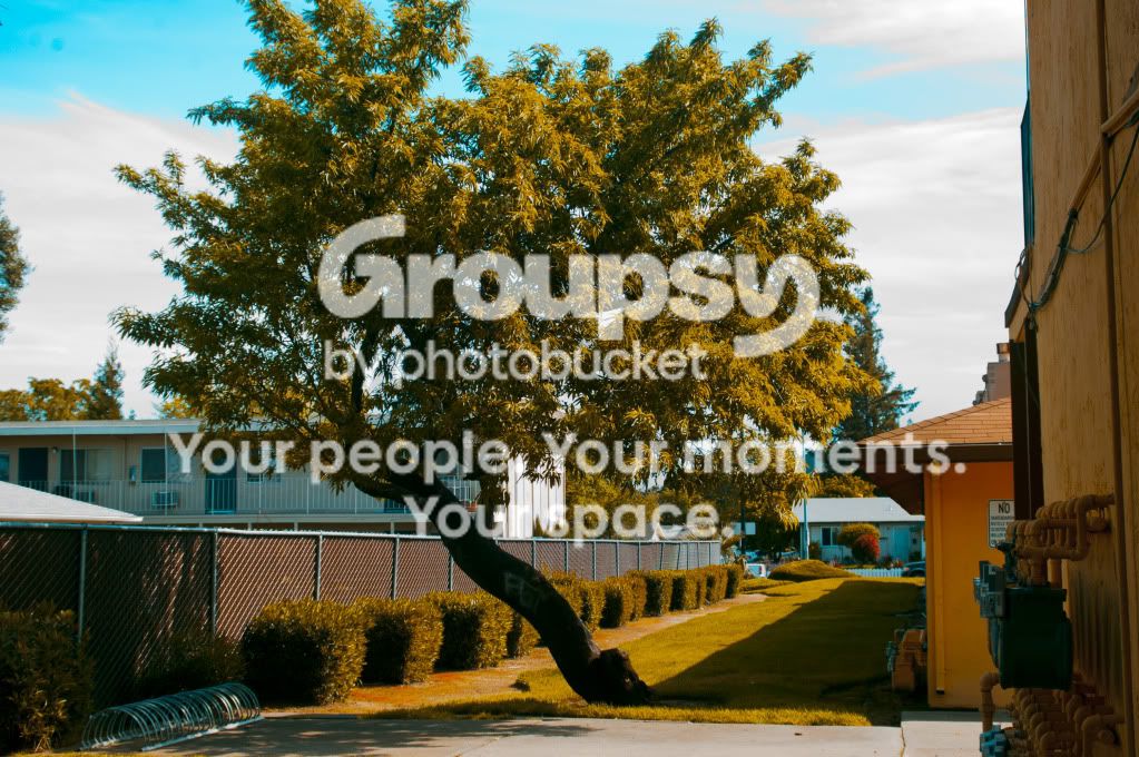
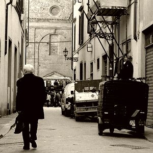
First and second look a little overcooked for my taste.
First doesn't have any compositional interest... what's the subject? The tree? How does the viewer get excited or interested or emotional about it?
Second has some merit. With a bit less cookiing and some cropping I think you might have a little bit of something there. Not a ton, but something.
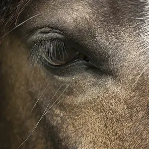
Last one has an interesting pattern but the angle and DOF take away from it (angle and DOF both too "steep")... too much uninteresting stuff in too much of the frame. Also underexposed.
1) I would have panned up a bit to get the whole tree, but that's just me.
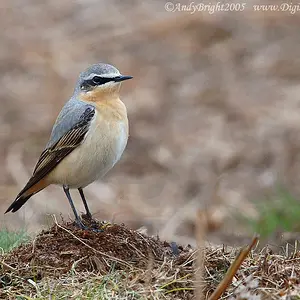
2) Maybe crop a bit so you just get the branch and the bird? It's definitely a cool shot
3) I personally don't like it - it's just not my style, but from a strictly photographic standpoint, I think it's a neat shot.
1) Tree is actually pretty cool, the angle that it grows. Take from a different angle, maybe stand more to the Left, work the motel out of the background or use more of DOF to enhance the subject.
2) Great Silouette, crop more towards the bird, doesn't instantly grab you into the pic because it is overtaken by the sky
3)I wish I had a lens that perfomed DOF like this
i really like the second one its right outside my window and i always imagined it with a bird sitting on the end of the brand and one day there just happened to be one there when i had my camera.
1st one is really not interesting at all. 2nd one is decent but really no point of interest. 3rd one you're getting on the right track but that thing isn't really something that jumps out in the picture. Keep working, beside the 1st one, you're on the right track.