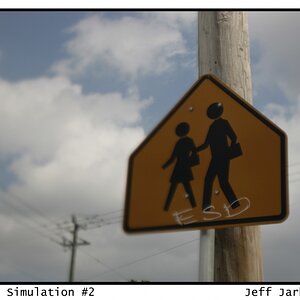
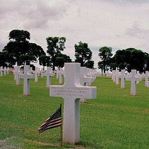
I really like number one, I like the guy's expression and I feel like your composition does a great job of pulling the eye in towards him. The only thing that is bugging me about is that the background is just so blown out-- it's bright enough to be distracting to the eye. You might try bringing the background brightness down a little bit so that we get a little detail (if not all of the detail is already gone). It's not a huge disaster or anything but I think it would make it more visually catching.
Thanks for the comments. Mitch, the girl wasn't supposed to be in focus. The man is the main subject. It might have been better to let her take a couple more steps to get her more out of focus. tsaraleksi, I too thought the background was too bright, but not distractingly so. But now that you mention it, I definitely agree. It looks as though the detail is lost, but I'll try darkening it anyway. Thanks!
also a huge fan of #1.
you've got beauty, youth, age, and experience in one shot. the expression on his face is great. the setting is very blown out, as stated, but i think for me, it still works because the subjects are exposed well, and tell the story without the background.

 )
)
![[No title]](/data/xfmg/thumbnail/40/40288-4d5d7a8aa74ddfceb5fb82062d9b21be.jpg?1619739409)
![[No title]](/data/xfmg/thumbnail/34/34483-f862f99992bbdd79e95d390a65e59f6e.jpg?1619736510)

![[No title]](/data/xfmg/thumbnail/40/40285-2ce5915035c220ccb3485030863b62d0.jpg?1619739408)