Fine, I'll bite...
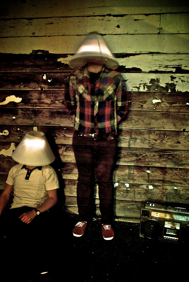
#1 is horrible. The processing is bad, the lighting is bad, the subjects are too close to the background, parts of the subject on the left are cut off, parts of the radio are cut off, the center subject is, well, centered. Overall, pretty bad.
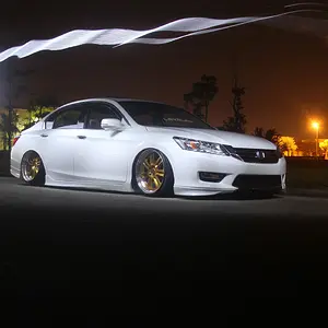
#2 is worse than #1. Between the fact that the entire image lacks contrast and about 50% of the frame is overexposed, which you turned into grey, is just bleh. Purple fringing, an unflattering angle, poor lighting, and a bad expression all come together eloquently to make this one of the worst images I have seen posted here.
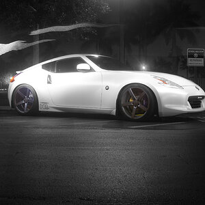
#3 is half decent if somebody wants a picture of a person holding their hands in front of their face...not sure why anybody would, but if anybody ever wants one, you got it covered.
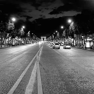
#4 is a decent snap shot...pretty much what anybody would get with any camera in auto with the flash on. Lighting is flat, background adds nothing to the subject, and the on camera flash is a bit harsh, which you can get away with a bit on this one since your subject is a little girl and the background is some distance away.