What's new

Some shots from downtown

zombiemann

TPF Noob!
Joined
Aug 8, 2012
Messages
359
Reaction score
24
Location
Illinois
Can others edit my Photos
Photos OK to edit
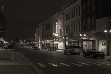
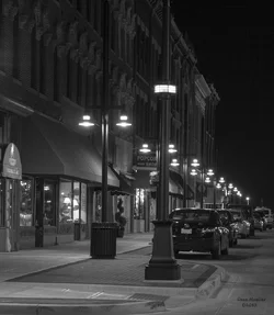
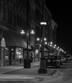
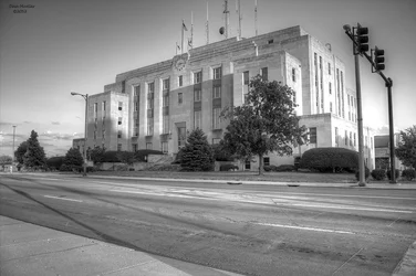
I don't really do much black and white. I do like the way these came out. They were shot in color and then converted to B&W in photoshop
1
$courthouse.webp
2
$Noir1.webp
3
$NoirMerchant.webp
 
#1 I think there's way to much empty space in the foreground. Also you cut the tops off of the antennas and it's not as sharp as I think it should be. Contrast is nice though
#2 There's really just nothing all that interesting
#3 Good technically, but again not really an interesting picture.
 
I like #3. Is kind of atmospheric. It is even maybe too sharp to fully create the feel of velvet smoothness of warm, summer night somewhere in downtown. It lacks only a few people on the sidewalk.
 
The two night shots don't have convincing blacks, they don't quite sell is "night" photographs. They're not super interesting, but they're not bad. Particularly the last one, if you got rid of that "veiled" look by pushing the shadows down to black if would be quite nice. I never really like the look of modern cars in these things for some reason, but whatcha gonna do?

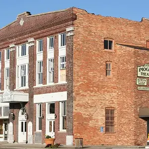
The first one is just a kind of an unattractive building on a road. I can see that you tried to find something there with the angle of view, and you get an A for effort, I just don't think it worked very well.
 
I tried to take pic 3 and make it a little better based off of what was said here. I might revisit 2 later, when I have time/motivation. I bumped the black up slightly, and added a slight gausian blur to soften it up a touch.

$NoirMerchantredux.webp
 
The tonality is definitely much improved. I like it quite well now.
 
It would be about a thousand times better if there were some classic cars instead of modern ones, but you gotta work with what ya got lol
 
#1 I think there's way to much empty space in the foreground. Also you cut the tops off of the antennas and it's not as sharp as I think it should be. Contrast is nice though
#2 There's really just nothing all that interesting
#3 Good technically, but again not really an interesting picture.

I disagree. I think 3 is exceptional. The squarish crop isn't my favorite choice, but very nice overall.
 

Create an account or login to comment

You must be a member in order to leave a comment

Create account

Create an account on our community. It's easy!

Log in

Already have an account? Log in here.

New Topics

Back
Top Bottom