1,2,3, & 4 have tonnes of dead space that doesn't give much to look at. I think I know what you're going for but then the images lack colour and vibrance. (Take a look at what Abraxas does with colour.)
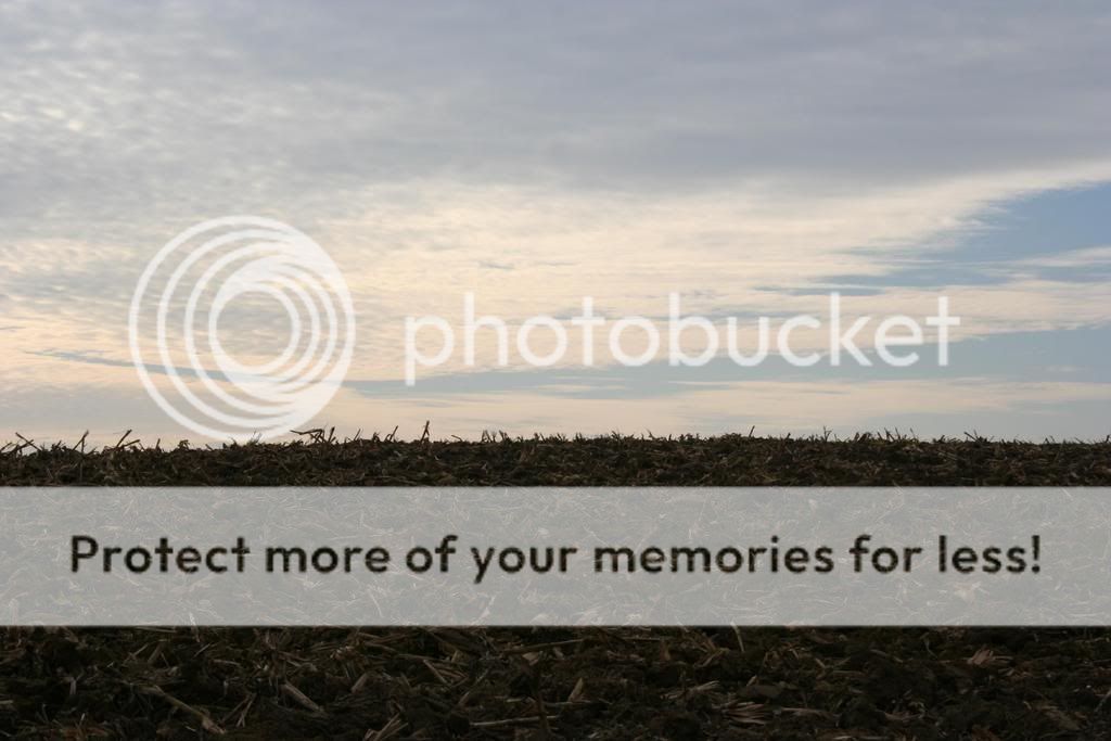
5 too but slightly better composition and if you adjusted the levels you could probably use it for stock\commercial.
All of them are very dark and not exposed properly. In Photoshop try adjusting the levels and add some more saturation.
It's great that you got out there and took these shots. I hope to see more of your work soon.