C&C per req:
1. I think more DoF would have helped here.
2. As per #1; it would be nice if the whole card were sharp. You're somewhat under-exposed and rather mid-tone rich. Try a contrast boost and curves adjustment to get more black and white and less grey.
3. A nice shot; it would have been even better if they could have been farther away from the background. As with #2 I think the monochrome needs some tweaking.
4. Unfortunately you've missed the focus here and the bride's face is soft enough to be noticeable, but not enough to be considered artistic. Also note the "racoon" eye - fill light image right was needed here. Lastly, consider your background, if you'd moved a bit to the right and had her turn slightly you would have had a much nicer background.
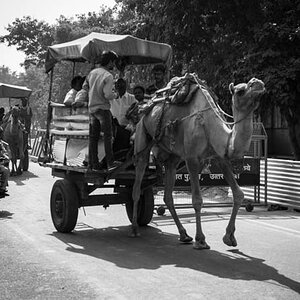
5. Too much DoF in this case; I think ideally the carriage and sign should be sharp, but the building very soft. Long glass and a large aperture would have been the way to go here. Monochrome as per #2.
Overall they're nice images with a few minor technical issues, most easily fixed. Monochrome conversions are nice, but don't over do it. Brides like to remember the colours of their wedding, especially the bouquet.
Just my $00.02 worth - your mileage may vary.
~John