AUS-10
TPF Noob!
- Joined
- Dec 20, 2009
- Messages
- 186
- Reaction score
- 0
- Can others edit my Photos
- Photos OK to edit
Any comments are greatly appreciated!
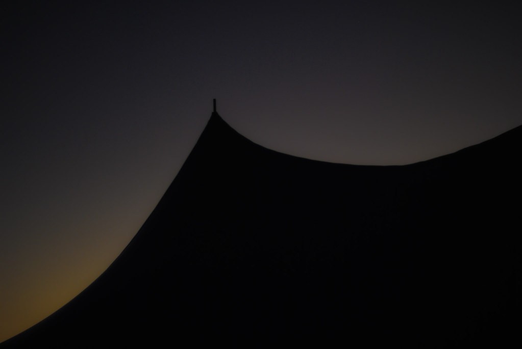
Red splotch in the lower left of #1 annoys me but I tried cloning it out and it looked like the lift never ended. Had to give it some closure. Crappy PP cloning and a bit noisy too. :x
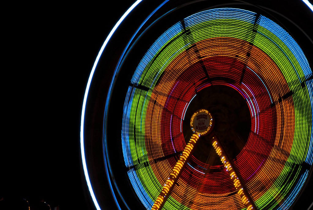
1.
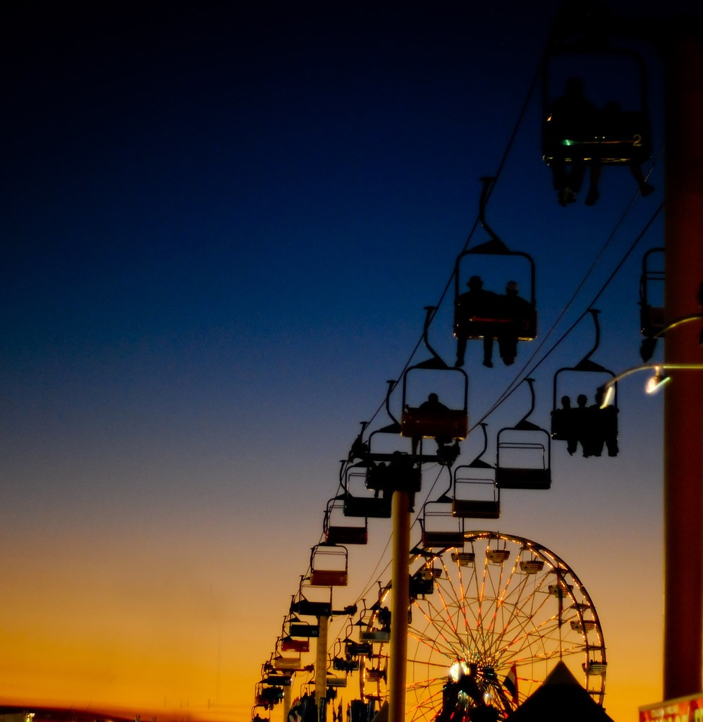
2.
3.
4.
5.
 http://farm3.static.flickr.com/2690/4301543830_ce0b147e9e_b.jpg
http://farm3.static.flickr.com/2718/4310106325_e4c0e45efd_b.jp
Red splotch in the lower left of #1 annoys me but I tried cloning it out and it looked like the lift never ended. Had to give it some closure. Crappy PP cloning and a bit noisy too. :x
1.
2.
3.
4.
5.
http://farm3.static.flickr.com/2718/4310106325_e4c0e45efd_b.jp
")


![[No title]](/data/xfmg/thumbnail/1/1592-cfae4a7ea791f96c6e2d03484be2e454.jpg?1619729144)