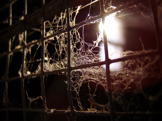
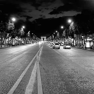
I like #1 because of the grate/fence. It might be a 'technically' better image if the lines from the grate led to the light, rather than seeming to point away from the light but that doesn't really make it a bad composition.
It's dark and gritty though and the fence or whatever those bars are give them image more depth. Me like.