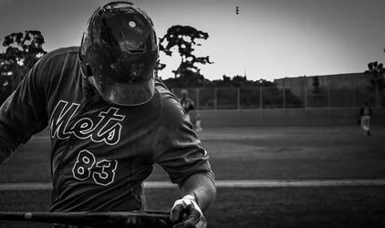
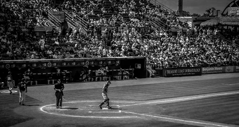
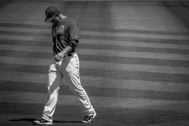
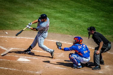
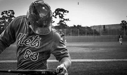
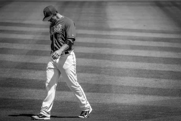
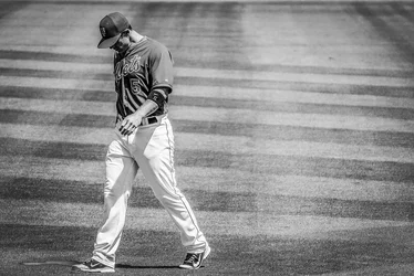
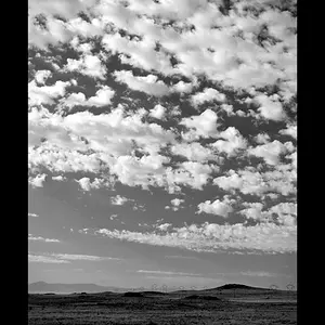
The monochromes seem VERY under-exposed, and they all seem to be framed rather tightly.
I like #3 & 4 better than the other two.
Faces and facial expressions are the holy grail of action sports photography.
I agree they all look under exposed.


I think they are nice but when I think spring baseball I think bright vibrant colors.
I think the black and whites have a nice feel to them, I don't mind them at all. I like the first one, I think it works pretty good without the face.
I'd think about adjusting the contrast in the B&W, to me it looks like the tone ranges from light gray to charcoal, there should probably be white in places like the lettering and some black in the bat etc. That might be due to the exposure, at least I find if I get a proper exposure the contrast is better. Nicely framed photos. You might want to take a look at Sports Photography and Photojournalism for Professional Photographers and Photography | SportsShooter.com , it's a site by some pro sports photographers.

Mlb4441, you don't say whether or not it's okay to edit your photos. I just played with the third one, which is my favorite. If you want me to delete it, I will, just let me know.
I edited it in LR4. Here is what I did. Exposure +1.50, Contrast +0.50, Highlights -55, Shadows +50, Whites -24, Blacks +13, Clarity +40, Pulled the tone curve down just a hair in the middle, Sharpened 86. I also used the brush to bring the exposure down on the grass on the right side in the really light and drew your eyes away from the player.
Here is what it comes up to.
View attachment 69755

Glad you liked it. Here's to Opening Day!!!!