Sr Photo Session - Taylor

twocolor

No longer a newbie, moving up!
Joined
Feb 26, 2008
Messages
1,044
Reaction score
227
Location
Utah
Website
www.twocolorphotography.com
Can others edit my Photos
Photos NOT OK to edit
I've decided to cut on quantity of photos I post per shoot, so as not to overwhelm the system. I've also tried to post with more intention. For instance, my first pic on here I really pictured "popping" more. What do you think???
1.
2883538962_11fe69bba8.jpg


2. does this tin wall work or no?
2883538372_b0c5f3d7fb.jpg

3. one from the studio session. I think I need to bring in a hair light????
2882701231_bee9dc5fe8.jpg

4.
2882700981_e30d7f4c5b.jpg

5. he's got such small eyes. I really like this one, but it almost looks like he's squinting . . .
2882700613_f616ff5fe2.jpg

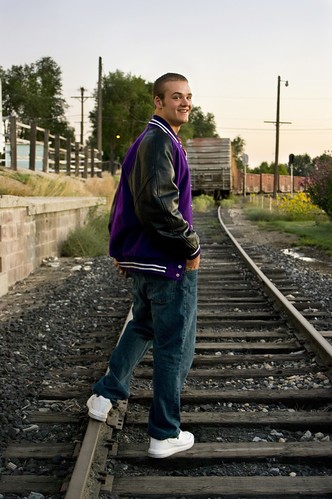
6. tried something new with this. I think I like it, him looking at his school jacket . . .
2882700179_069f71d652.jpg

So, I'm posting with specific questions in mind, because I want to improve my technic. Especially with seniors, I want to stand out above the local photographers with what I can offer. Tis the season for seniors!
 
I'll try to comment on your specific issues...

#1. It feels a bit weird to be looking down on him like that, but the composition seems to work. I'm not really getting much 'pop'. Maybe try some more extreme processing, like jacking up the saturation and adding some contrast etc. The bright white shoes are a bit distracting here.

#2. The tin wall could work...but overall, this shot isn't doing it. He's not looking at the camera, he's looking away and probably at something specific. Looks like a candid outtake. The crop feels too loose. I'm picturing a head & shoulder's shot with the tin behind him.

#3. I like it, and yes, a hair light would certainly have helped.

#4. I can see the idea working, albeit a bit cliche...but this shot isn't quite there. It seems like you are too close and using too wide of an angle. Again, the shoes are too bright and the crop feels loose.

#5. I really like using the train for a background, that's great. I thought his eyes were closed, not just squinted. This is tough, you will run into these people who are hard to shoot...you can try things like getting them to close their eyes and open them on the count of 3...etc. Maybe it has to be a trade off with the smile...but it's really hurting this image, which is otherwise great.

#6. I can see the idea you are going for...but this one isn't working. At least not at this small size. I think he needs to be much bigger in the frame, and then the jacket can be in the background or something like that.

Overall, I feel that the outdoor ones are too loose...especially with his squinty eyes. I'd suggest getting closer by using a longer lens. These 'environmental portraits' can work sometimes but the subject needs to be engaging the viewer to draw attention to themselves.
 
okay, here's an edit on the first. I jacked the saturation, contrast and brightened his eyes. It looks borderline too extreme on my computer, but here it still looks flat. Not as flat, but still flat . . .

2882905317_2b7cf98d34.jpg
 
here's another, it's a "head shot" in front of that same tin wall. Does his hand look weird though?

2882919497_2cdb6df42f.jpg
 
I like 1, 5, and the idea for 6.

#1 - I like your edited one more
#2 - Not a big fan of. The tin wall is fine but the picture isn't telling much of a story. I would like him looking at the camera and doing a different pose. I don't know that I ever see people stand like that. It doesn't look comfortable.
#3 - Is nice
#4 - Maybe a bit too centered for my taste
#5 - I like. As far as the shoes, I ran into this problem in a recent shoot. I just selected the shoes and brought the brightness down. It did wonders.
#6 - I like. However, the thing that bugs me is that the jacket is floating. I keep wondering if there is a ghost or an animal running off with the coat. It would be good to see the jacket on something.

Oh, the picture you just posted, the headshot, I don't like all the dead space. The arm is a little weird and it doesn't allow you to do a tighter crop. I think the lighting is great and he looks great, but the arm, the angle, and the dead space are distracting.
 
I really like the edited shot, there is your pop. I also like the second tin wall shot, I don't think the hand is distracting. Overall nice images.
 
okay, here's an edit on the first. I jacked the saturation, contrast and brightened his eyes. It looks borderline too extreme on my computer, but here it still looks flat. Not as flat, but still flat . . .

2882905317_2b7cf98d34.jpg
It looks a little yellowy/green to me. Hmmm. I hope you don't mind, but I played with it...if you want, I can take it down. I just did a curves adjustment to bring out some color and contrast.
379574155_wxGMK-M.jpg
 
Also, the part to the left showing the tin wall is a little bit distracting to me. I would probably clone the grass to fill the space on the ground and clone the red wall/door post to cover the tin part.
 
Yeah, I like your edited version better. Thanks! In curves, did you just play with your green and blue channels, or what? I'm not very comfortable with my ability in curves. I need to find a tutorial or something! I'll see if I can get rid of the tin wall and the little gravel spot on the ground!

Thanks!
 
I actually just adjusted in RGB. I brought the two corners over slightly and then fiddled with the s-curve in the middle until it looked good to me. I hope that makes some sense. I used to adjust using the saturation slider, but I found the colors always look crazy to me. Here's a youtube tutorial for ya.[ame="http://www.youtube.com/watch?v=ORM6AZY19pw"]Here.[/ame]
 
Nice work!
You should definitely add the kicker light for the studio shot. Get that separation on his shoulders too, not just the hair and the image will look Really sharp.
 

Most reactions

New Topics

Back
Top