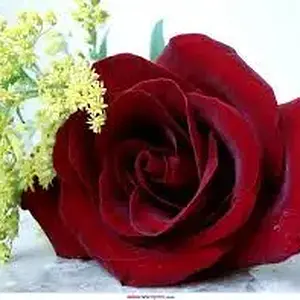
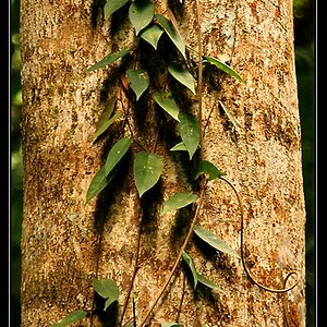
Personally I think the crop and composition work well with it. It kinda emphasizes the "stand out" annotation. Looks like theres a bit of the ol rule of 1/3's in here, and the lighting is just outstanding. The detail in the flower almost makes it look like its pasted onto the background. It could be interesting to have another take, on a bit more of an angle (pending the background cause this one works well i think), rather than from straight on top to give the actual flower a little bit more depth.
Great pic tho....I love it. If it were mine, it'd definitely be going on the wall in a nice 11x14 frame:mrgreen: