What's new

Stark light

Maxx RS4

TPF Noob!
Joined
Jan 9, 2007
Messages
86
Reaction score
0
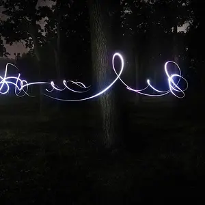
I love the simplicity I achieved in this one..
Comment good/bad please!

bulb2.jpg
 
mmmmmm negative space

i love simplicity and negative space in photographs


i kinda wish the corner wasnt there, right behind the lightbulb, its distracting.


also, i dont know if this would work, but i like fracturing subjects, i dont know if it would work, but maybe try fracturing the image, so we only see half or part...i dont know, just throwing out ideas here...

but all in all i really like this
im drawn to it...almost like a moth...
 
I love the simplicity I achieved in this one..
Comment good/bad please!

My comments are that I love the picture, the corner is distracting and, if you tell everyone that you love the picture, you may not hear from the people who don't like it because they may not want to insult you or hurt your feelings.

Sort of like, 'This is my baby, Tell me how beautiful she is.'

 
I really like this...the corner is distracting... Try cloning it out because there is only a little bit of it there.
 
My comments are that I love the picture, the corner is distracting and, if you tell everyone that you love the picture, you may not hear from the people who don't like it because they may not want to insult you or hurt your feelings.

Sort of like, 'This is my baby, Tell me how beautiful she is.'

I don't think I'd ask for the bad if I didn't want it and I wouldn't post it up if I didn't think it was worthy.

But there can always be improvement on even the best of things!

Thanks for all the input so far. I'll try the cloning but don't know how that'll turn out since I'm just barely getting started with PS.
 

Create an account or login to comment

You must be a member in order to leave a comment

Create account

Create an account on our community. It's easy!

Log in

Already have an account? Log in here.

Back
Top Bottom