Juga
No longer a newbie, moving up!
- Joined
- Jan 18, 2013
- Messages
- 1,291
- Reaction score
- 400
- Location
- Charleston, SC
- Can others edit my Photos
- Photos OK to edit



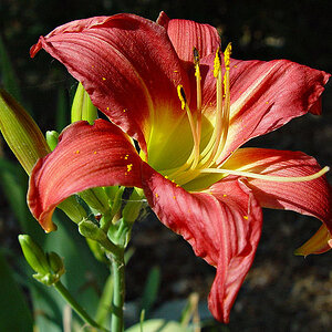
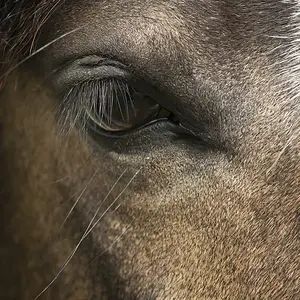
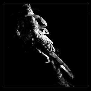
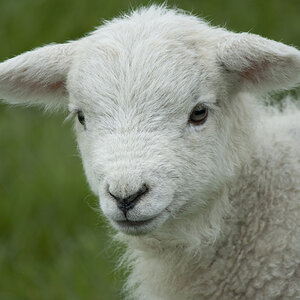
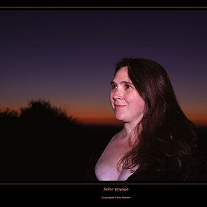
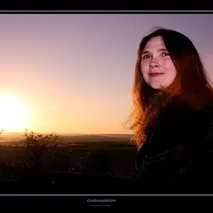
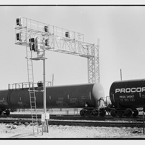
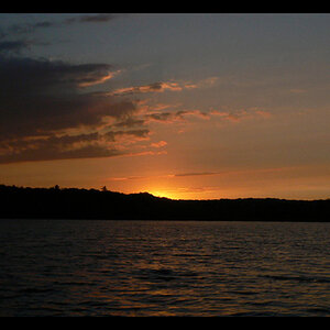
Good morning to all. Please provide feedback at will. I usually post how I shot the picture but I am going to refrain from that method this time as I expect nothing but negative comments. :lmao:
 :lmao:



![[No title]](/data/xfmg/thumbnail/39/39497-93752210dd49247220721e5ac8c61245.jpg?1734173613)
![[No title]](/data/xfmg/thumbnail/39/39499-b11b4321c0f029e3a5523ccab621b71c.jpg?1734173619)