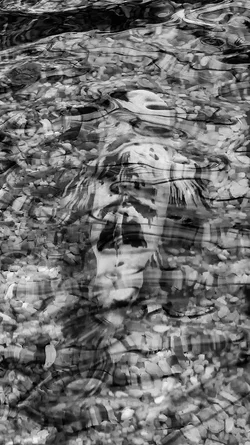
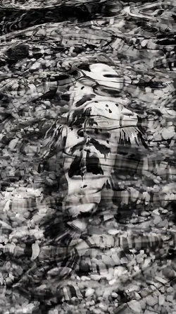
Of the three versions you posted (B&W, colour and duotone) I prefer the original B&w because it is quite subtle, and makes you question what you think you're seeing (usually a good thing!). It is the simultaneous clarity/detail and subject ambiguity that appeals to me. The colour version reduces that ambiguity (and makes me wish you used a CPL), while the duo-tone is more obvious, but intrigues less, if that makes sense to you.






 Do settings need to be adjusted when using an adapted lens?




![[No title]](/data/xfmg/thumbnail/38/38724-0b9c26c57726c91c6c504310e4428e55.jpg?1734172598)
![[No title]](/data/xfmg/thumbnail/36/36132-5bd4fa365c199003273e0ff128bf42f4.jpg?1734168228)
![[No title]](/data/xfmg/thumbnail/37/37930-501fdf314a05686acde53d9899f68091.jpg?1734171674)