C&C per request:
Overall some very nice shots...a strong start to working with your new lighting equipment.
Shot 1)
I like the model's expression, the tilt to her shoulders, and the quality of the light across most of her. I like having her face square to the camera in this shot, but I wish her torso had been turned slightly. Admittedly I've never been too fond of poofy sleeves, but with her shoulders square to the camera and the poofiness of her top her shoulders look much larger than they really are.
The side light, illuminating her right cheek, is too bright. I like the position of it and the definition it gives to her cheek and jaw, it's just too bright in comparison to the rest of the lighting.
I think the crop is either too tight or not tight enough. With the widescreen ratio you've picked and so much dead space to the left, the very tight vertical crop seems out of place. It's just a weird combination of vertically cramped yet horizontally expansive. I would suggest going a bit higher on her head (I like where you've cropped the third shot) and a bit lower so that the bottom of the frame isn't right at the bottom of her v-neck. Alternatively you could go for a very tight crop. If you crop from the left so that you just remove the poofy sleeve (leave space beside her ear) you can get a square image with nice upper-left to lower-right dynamics.
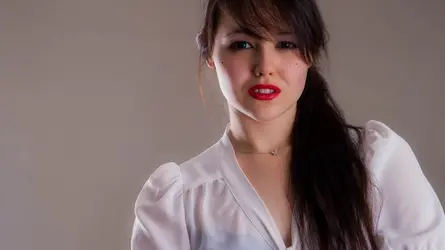
Shot 2)
I like this shot a lot - the pose, the composition, the lighting, the little splash of red from her lipstick. The lighting here is brighter than the other two shots, did you change your setup or was that a processing decision? I like the brighter, higher contrast feel to this one.
I do agree that it is jut a tad too tight a crop on the top and somewhat on the left. It feels this way because her ear is just barely being trimmed along the top and doesn't have much space on the left, as if it's been crammed into a corner. It's also a somewhat unfortunate crop across her hand, coming from her wrist and showing just that portion of the heel of her palm (the dreaded amputation crop).
One variation that I think would make a great image is this same pose but without her hand up to her head, instead hanging down out of the frame. Then you can either leave the dead space on the right (that would work since she is "looking" that way) or crop it out.
Just out of curiosity, was the point of this pose to showcase the tattoo or was it just a coincidence that the ink is so nice and square to the camera? If showing the ink was intentional, I would play with local contrast and/or burning to give the tattoo around the same feel as the other dark elements (her hair, eyelashes...).
Shot 3)
Very nice pose and composition. Often you hear that you should have white showing on both sides of the iris, but I think the angles of her torso, her face, and her eyes work nicely together to tell a story.
As with shot 1, your side light is a bit too bright. Her right arm is brighter and whiter than the rest of her skin. That light is also illuminating just a streak of her hair, and the brightly lit red seems out of place with the rest of her hair. You can try dodging the rest of her hair to bring out her highlights and give her hair a uniform feel. If you really want to get picky you can clean up some of the most extreme stray hairs (around her left shoulder), though I wouldn't worry about trying to give her a perfectly coiffed hairdo.
As always, these are just my opinions, take them or leave them as you will.


![[No title]](/data/xfmg/thumbnail/42/42022-b164b48fbcd31e32040c4983ecb8983a.jpg?1734176406)
![[No title]](/data/xfmg/thumbnail/42/42459-a7a996b715ff4999d07738140fdd0fe3.jpg?1734176996)


![[No title]](/data/xfmg/thumbnail/42/42462-2adb6efc01a19638fca25cd3000f5575.jpg?1734176997)