Still trying.. Need your inputs.

abhishekdg

TPF Noob!
Joined
Apr 15, 2012
Messages
175
Reaction score
11
Location
Minneapolis
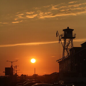
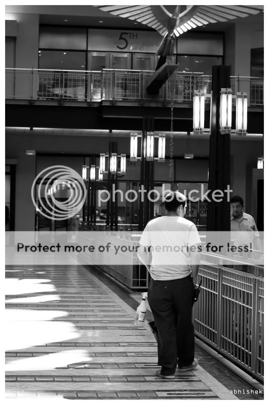
Ok, most of my previous pictures on street photography seems to have failed miserably and have got quite a few negetive comments which I personally like a lot as these comments show you how much you have got to improve .
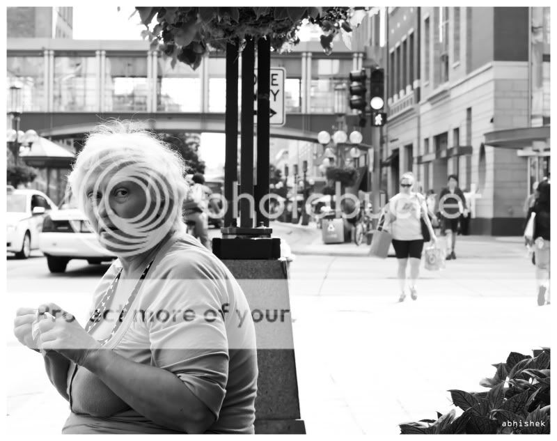
hence, went out yesterday with the D90 and the 50mm f/1.4 age old lens to try out some more candid street stuffs.
Please criticise hard as i feel i am gettng addicted to street shots and really want to improve in these.
Its all the criticise comments that make me feel that I have so long a way to go in street photography.

musician.jpg


downtown_3.jpg


downtown_5.jpg


downtown_6.jpg
 
#1 is great. Love it, the others don't do much for me
 
What follows is only my opinion so understand that I am very opinionated.
I hope you read it as having the good intentions that I mean.

Lew
______________________________________________________________

I think that #2 & #3 aren't really anything. #2 because it is entirely unclear what is going on and why you took the shot. #3 because the man is probably the center of interest but he is poorly defined, the cup/table area is the brightest part and draws my eye and there is lots of bright space that doesn't contribute.

#4 is interesting but because it is poorly framed, I think is a failure. There is all that space at her back that doesn't mean anything and yet she is pushed against the left margin. There doesn't seem to be an artistic reason.

#1 is a picture that is tempting to call nice because it is sharp, in focus and the person is doing something interesting.
That being said, what part of the picture should we actually be looking at?
I would think the face and the interaction between hands and instrument are the important things.
Yet these are crowded to the top and the rest of the image is filled with things that are in focus, that don't really add to the center - and so take away from the impact.
And the picture is filled with bright stuff, all brighter than his face.

IMO, the major reason to convert from color to bw is to control where the viewer's eyes go.
The eyes go to bright stuff, to colorful stuff and lastly to darker stuff.
I would crop this to remove stuff that doesn't count, darken all the bright stuff you can, give his face some emphasis with selective sharpening - give it some impact.


musicianlll.jpg
 
I disagree.
I think you need these cropped items to truely define this subject as a street musician. To me, even the duct taped cup adds interest to the scene.
In fact I agree with Gary above. It's hard to say what is outside the frame, but I would like to see more. Sometimes more is better.
 
Last edited:
It is true, perhaps, that a wider view might make a better picture but we are presented with the picture above.
 
Thank you guys so much for criticising the pictures. These critiques are really helping me to find out the mistakes and how to improve my street photography. Next time would keep these pointers in mind while shooting.
 
Thank you guys so much for criticising the pictures. These critiques are really helping me to find out the mistakes and how to improve my street photography. Next time would keep these pointers in mind while shooting.


Shoot wider you can always crop, something i don't like doing because i like to get it right first time
 
I agree with Rick I like #1 the sax player. That is a wonderful piece of street photography, I would not have touched the image at all from what you have. The only thing I would probably have done different was made it slightly more contrasted but that is just my opinion. Still its a wonderful work and I think it is awesome.
 

Most reactions

Back
Top