Some comments -
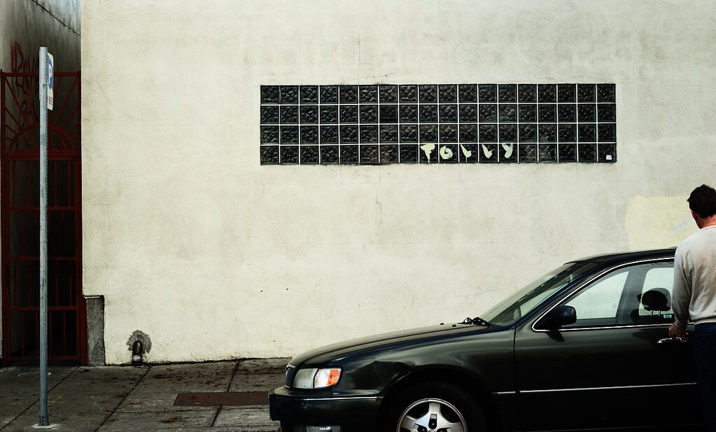
1. Interesting composition - I like the tight crop on the guy and the car and the way he is almost out of the frame. The car's tone and textures are repeated in the windows. Something about this makes me keep looking at it. What would your title be?
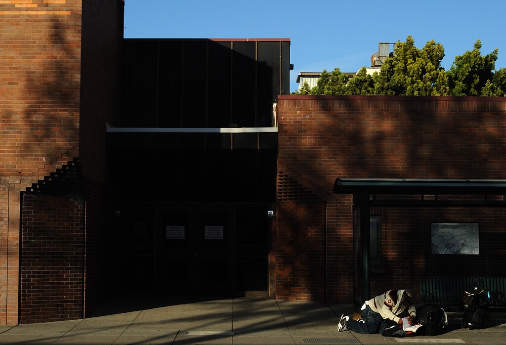
2. Light is too harsh for me - it's all shadows and it doesn't really frame or set off the old man. In more even light this composition may have shown him as being very small in his surroundings.
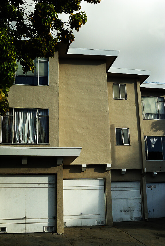
3. A depressing-looking building with some character, but I think the lean detracts from it. Try straightening it with perspective correction or skew or one of the other controls in PS. If you can go back, a horizontal might be more effective, assuming the building continues like this to the left and right.



![[No title]](/data/xfmg/thumbnail/36/36135-6594fe1d58af0053c3e939665e543ce4.jpg?1734168245)