Composition is actually rather complex and there is no simple formula that fits everything - only guidelines to help. There are a number of factors that have to be taken into account when composing any picture, including balance, space, tone, colour and intention.
The 'Rule of Thirds' is happily trotted out whenever composition is mention in Photography, but it is only of limited usefulness. It is popular though because it is ostensibly simple and relatively easy to understand. But sadly, most people who mention it don't actually understand it or how it works.
So what is it?
Basically one divides an image up using two equidistant vertical lines and two equidistant horizontal lines to give nine equal rectangles.
There are now two ways to use these guides.
The primary object can be placed at the intersection of two of these lines, or a major structural line (for example the horizon) can be aligned with one of the lines.
The idea is to 'balance' the image, either balancing the main subject with the larger space around it - or balancing the lighter 'mass' (sky) with the darker 'mass' (ground).
This balancing results in a sense of repose or calm. The visual dynamic becomes static.
Putting the horizon along the top or bottom third divider works well for most landscapes for this reason.
Putting the subject on an intersection only works if you want a feeling of stillness and you have only one or two main subjects and the rest of the image is relatively plain and uncluttered.
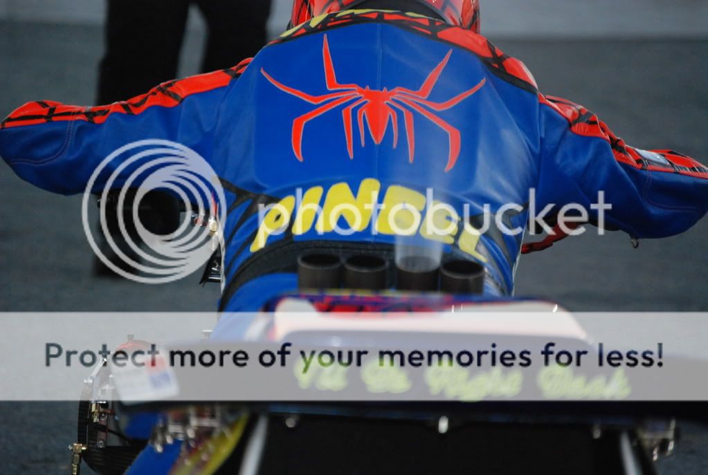
The first image here is of a motorbike doing a wheelie, presumably as it pulls away. But it is reasonably sharp with no movement blur. It also has about 2/3rds of the image space in front of it. This large dead space pushes back against the 'bike visually.
The net result is that the image is dead and lifeless. There should be a sense movement and power but instead we get nothing.
Putting the 'bike in the right hand third would have all that space 'pushing' behind it and we would start to get a sense of the vehicle about to leap out of frame. Far more dynamic.
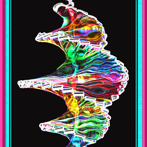
The second image is similar. We should get a sense of energy held in check but instead we get... nothing.
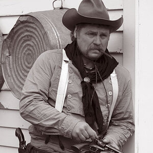
The third is just confused.
The problem is not really with the composition - it's with the intention.
You have no real idea of what you are trying to communicate to the viewer: the reason why you are taking the pictures.
This is what you have to tackle if you want your pictures to move on from being just snapshots.
What is it you see? Why do you want to take the picture? What do you want the viewer to feel?
Ask those questions and the pictures you take then become a way to find the answers and your photography will begin to improve