the shape of the catch lights don't bother me a bit.
i think this is a beautiful image.
i don't know much (anything) about studio lighting so i can't help there.
i think you've captured her beautifully.
i did play though.
just wanted to make those gorgeous eyes pop a bit.
and add some dark edges.
Hey Jon. Since you didn't mind kalee posting an edit, I thought I would show you my ideas.
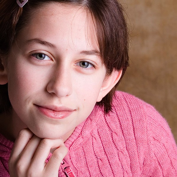
I really like this shot and your lighting. The only thing I would really do is tone down the overexposure, as Matt said. Using the curves tool works great. If you just work with contrast, the highlights can remain blown.
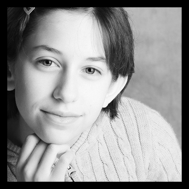
If you really want to go for the high-key look, I think B&W works great. Probably still needs a lighter background, though.
(100% red channel, reduced levels on background, small curves adjustment on all, slight sharpen after resize)
I put a black border on it to try and keep the blue forum background from tainting it.
thanks for having a go at it Mark...and thanks to everyone. You're ideas are really helping me as I'm trying to refine my studio photog and post processing of studio pics.
I can see what you're going for here mark but I do have to say I find it a bit washed out looking; especially in the lips. There must be a way of retaining contrast at the same time as producing the hi-key effect.
anyway....I was playing with this some more and really like the toned version. I also tweaked the hilight level in curves. Did I tweak it enough?
Yeah, that was just a quickie as an example, not what I would settle with. I like yours better. I might bring it up a touch, but that could easily be attributed to monitor differences.
High-key is usually washed out, which I don't think works well with this image. It probably should be the intent from the begining.

")


![[No title]](/data/xfmg/thumbnail/42/42055-105f2ee23a1fd79c786de42c5578274b.jpg?1734176440)


![[No title]](/data/xfmg/thumbnail/39/39189-22b7e8d8eadc9cc3d7b341bfb336079e.jpg?1734173064)