What's new

Studio work

kathyt

Been spending a lot of time on here!
Joined
Oct 11, 2012
Messages
3,759
Reaction score
1,888
Can others edit my Photos
Photos OK to edit
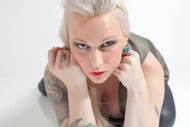
I don't do a whole lot of studio work, but I enjoy it every once in a while. These shots are with one speedlight, camera left, and 1 strobe, the Einstein™ E640 Flash Unit with a beauty dish, on the right. I am using the Pocket-Wizard Plus II's as my transceivers. I really like the look of a clean, white paper backdrop with a subject that is this dramatic. I have my favorite of this set which is #4. Any cc welcome. Thank you.

#1
$molly-1.webp

$molly-2.webp

$molly-3.webp

$molly-4.webp
 
They are lined up in my original post, I don't know why they look so funky now.
 
I like them overall but would like a whiter background. Does that make sense? Did you light the background or just let it fall where it fell?
 
I like them overall but would like a whiter background. Does that make sense? Did you light the background or just let it fall where it fell?

I did not light the backround because I didn't want to lose my shadows. I also didn't want any extra light in her hair.
 
I like them overall but would like a whiter background. Does that make sense? Did you light the background or just let it fall where it fell?

I did not light the backround because I didn't want to lose my shadows. I also didn't want any extra light in her hair.

Makes sense. I only really see a little shadow on 1 and 4. Is that what you are talking about?

Couldn't you light the background separately from the subject? In other words none of the background lighting would fall on the subject. I guess there are space concerns as well as needing enough light sources.
 
C&C per req:

The crops seem a little awkward to me, especially the last one where you have bisected her left upper arm and finger tips. I understand what you were going for (I believe), but to be honest, I'm not overly fussed with the results These almost seem like high-key shots that didn't work. I think another light on the background would have indeed helped a lot. I also think that with her colouring and somewhat dramatic appearance, a different background colour, say jewel tone, or black, would have added a lot of punch to these images.

Just my $00.02 worth - your mileage may vary.

~John
 
i agree with the whiter background, also on #2 did you purposley focus on the elbow?
 
I don't find the cleavage works in these. There are few highlight hot spots that could be fixed as well. It would have been nice to see her smile.
 
I don't find the cleavage works in these. There are few highlight hot spots that could be fixed as well. It would have been nice to see her smile.

Gonna have to disagree with this. Cleavage always works for me.
 
Your lighting ratio is too even and by having a light on both left and right, you have lost your modeling (shadow).


....... I also think that with her colouring and somewhat dramatic appearance, a different background colour, say jewel tone, or black, would have added a lot of punch to these images.

Just my $00.02 worth - your mileage may vary.

~John
+1
 
I am not so sure I'd consider these really dramatic lighting. They're nearing pretty flat lighting. You have just enough difference to give you a nice dimension to her features, but no shadows. Beautiful for portrait lighting.
4 is my favorite too. I'd soften her hot spots.
The first seems really soft. I am ok with the clevage here-it doesn't pull the eye too bad, but I think you edited to pull the blouse into place more and something isn't quite right there. Or perhaps it's lace?
The second I know you're focusing on her elbow & tattoo for a reason and I'd love to see more of your playing with the idea. It's not working so well for me in this one because her eyes are what draw you and they are OOF (properly) and that doesn't feel so right. Perhaps if her head were turned away from the camera and not staring it straight down like LOOK HERE. Her face and look in this one are very compelling and eclipse the tattoo. I think it would then work very well for what you were trying to do. Her face and shoulder seem very very orange, when the arm and below the upper arm tattoo on the other seem proper. I am OK with the cleavage. It's not a hard draw on this one, though something (at this size) looks like a nipple on the inside of her left/our right breast-definitely where it's not a nipple. There looks like there could have been editing done along that side of the blouse that doesn't blend well.
The third feels soft on the eyes too. I am not a fan of this tilt for her here. She's got the bump going on with the hair. That combined with the natural distortion is not so flattering to the forehead and bump. It feels like a lot of hair bump in an almost Martha Washington way with the side of her hair. The evil look doesn't seem to be working in this image for her. She's got a gorgeous face and the serious would be fine, but this one is just not doing it for me.
The 4th has a little less of a flat face to it than the others. Maybe that's why I like it so well on her face. Her serious look is just gorgeous here. Her bone structure shows through beautifully. I would like to see more of her tattoos-I think that is a lot about HER as a person, but with just the bit of the one and the arm piece I'm not feeling the love so much. The shirt is not belly flattering to her and I know she's a thin girl from your other shoot. The crap of her arm and fingers you already know.

They are a gorgeous set. Well exposed and excellent use of your flash/white background. Clean, clear and the color is great (I know that the one i don't like the color on is from the shadowing.) I'd say it was a gorgeous, successful shoot!!!
 

Most reactions

Back
Top Bottom