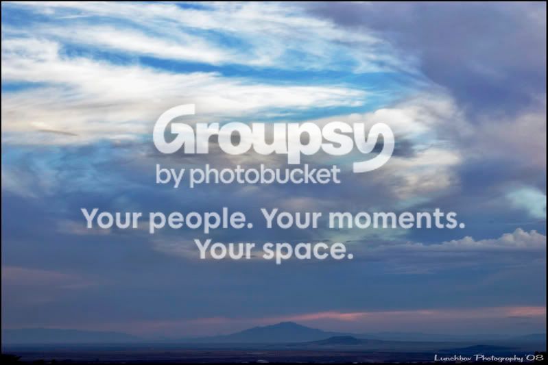
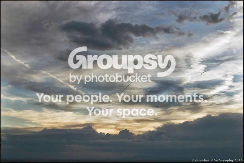
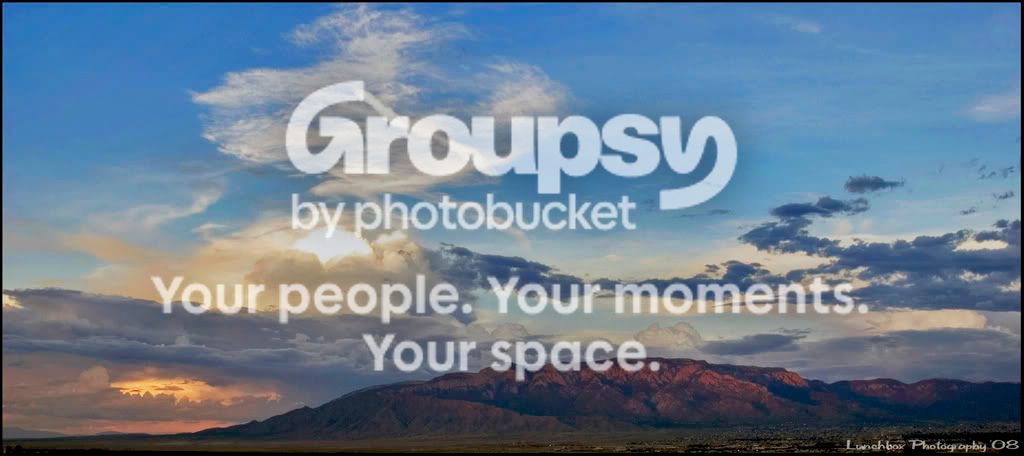
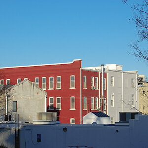
The second is clearly my favourite and I like that you kept that line of land at the bottom as an "anchor" for that sky! It could do with a slightly more "sculptured" definition, though, I think, like upping the shadow levels from 0 to 12 or 15, and likewise upping the highlight levels from 255 to maybe 235 (or wouldn't that rather be: lowering?), and if then the yellow saturation (only that, no other colour) could be intensified and a bit of unsharp mask (not too much!) were applied, I think that one'd really be breathtaking!






![[No title]](/data/xfmg/thumbnail/37/37095-648a4e65f10e6fdeeb231be5ed8c3152.jpg?1734169827)
![[No title]](/data/xfmg/thumbnail/42/42040-7a66cabbeffd44783ea44a91ef4d0e70.jpg?1734176423)
![[No title]](/data/xfmg/thumbnail/37/37094-a3c300cd42f78d01d01fe80c1233002e.jpg?1734169827)
![[No title]](/data/xfmg/thumbnail/37/37602-1ef8dbb1c2d0e4ff347ee65d328c3603.jpg?1734170730)
![[No title]](/data/xfmg/thumbnail/35/35587-16c570d2927f2a9ea1945320686eca01.jpg?1734167214)