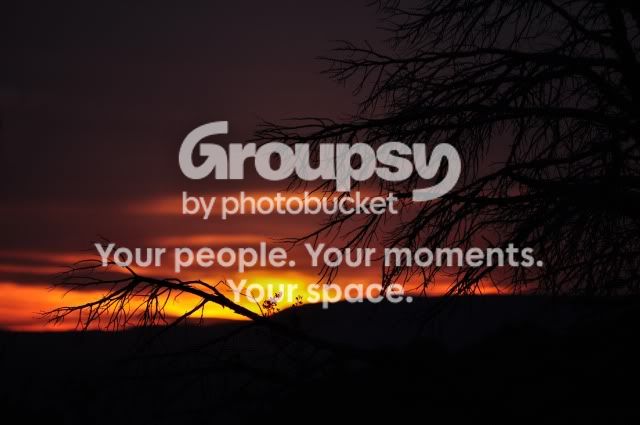
I like number three the best- It's more appealing to my eyes because you chose to put less of the silouhetted foreground in the fame, to get more of the nice orange sky in the frame. The light slop of the hill follows the rule of thirds nicely, as does the position of the brightest area of the sun disappearing into the horizon. Simple, and visually relaxing =)
The other two both have either too much distraction from the tree branches, or less compositional value. I do like the "smoothness" of the colors in the first photo though. Good job, and don't be embarrased to use the scene modes from time to time- they can be a quick way to capture something on the fly, and it seemed to work nicely here!







![[No title]](/data/xfmg/thumbnail/36/36603-a830ccec573081105d6aafcccc650605.jpg?1734169056)
![[No title]](/data/xfmg/thumbnail/32/32433-abebb6cea0cf29d5f27d9054c7b0664e.jpg?1734161774)