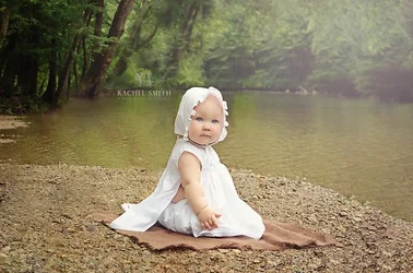
Yes, as three others have touched upon, the framing on this is hurting it. Smack dead center is not good. The baby's body is "pointing" to the right, but there's an almost equal amount of space on both sides of her head...that causes a visual tension...it's a peaceful subject, and a bucolic, natural-world scene...the tension just ruins this shot. Two steps to the right with the camera would have given more space on the right and improved the background I think. Even cropping off some of the left side, and a little bit off the top, to "move the subject" around in the frame will improve this. A little bit lower camera position would have moved her head quite a bit in relation to the water's vanishing line, and would have added more three-dimensiuonal feeling...
The background as shown is almost perfect though! The gravel bar she's sitting on, the tiny bit of gravel bank shown at the left edge, the way the trees anchor the left side, the pool, all the background stuff is just simply wonderfully done, very subtle, VERY lovely. Natural, subdued, balanced, just super. The placement of the baby though, is too centered, in relation to the background. That's why I specifically said "two steps to the right", as opposed to cropping; cropping is the only choice you have now, and it will chance a virtually perfect background into a stil-pretty-good one, but it will not be quite the same.
The fake flare??? I dunno...it's well done, but the deep contrast in the trees on the left makes the flare appear "faked", not real. The flare does sort of give a vintage-ish twist to it.




![[No title]](/data/xfmg/thumbnail/42/42273-78c0ae886bd5e6d47580353f398c92b9.jpg?1734176676)
![[No title]](/data/xfmg/thumbnail/37/37136-40f690dc7da693c09d7c99c3782954b8.jpg?1734169835)