What's new

T-Shirt Company Photoshoot *CC*

Geaux

No longer a newbie, moving up!
Joined
Feb 21, 2010
Messages
2,522
Reaction score
464
Location
New Orleans, LA
Can others edit my Photos
Photos OK to edit
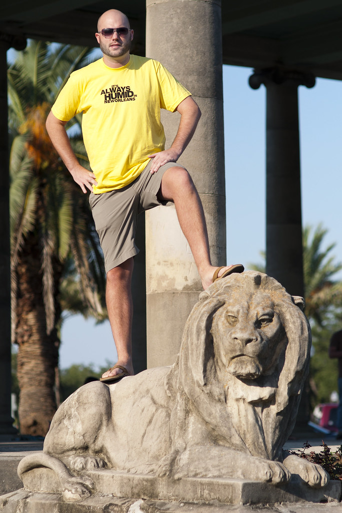
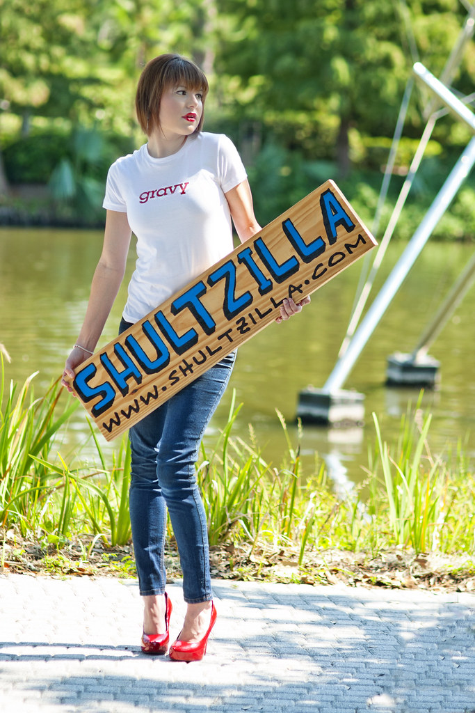
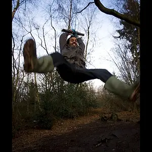
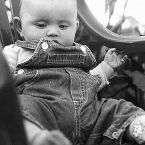
A little backstory: Friends of mine opened up an online Tshirt company a while back and had point and shoot shots as their product shots on their website. I offered to do the shots, free of charge, so they could up their 'stock' in their website to maybe appeal to more people. They wanted the hipster type shots as opposed to regular stock tshirt images. They'll have the image used on the shirt and then a bunch of other photos of people wearing them. We had 7 or so models and they wanted a 3pm start time, so I knew I was in for some harsh shadowing, etc. I was also using my 85mm 1.4 for the first time on shooting people, so that was a funtime also lol. I made a rookie mistake by leaving my iso at 100 after the sun starting going down and was left with some slight motion blur in the afternoon. Not all the shots were a wash though, only some suffered from that issue. Here are a few of the shots I got, let me know what you think.

1.
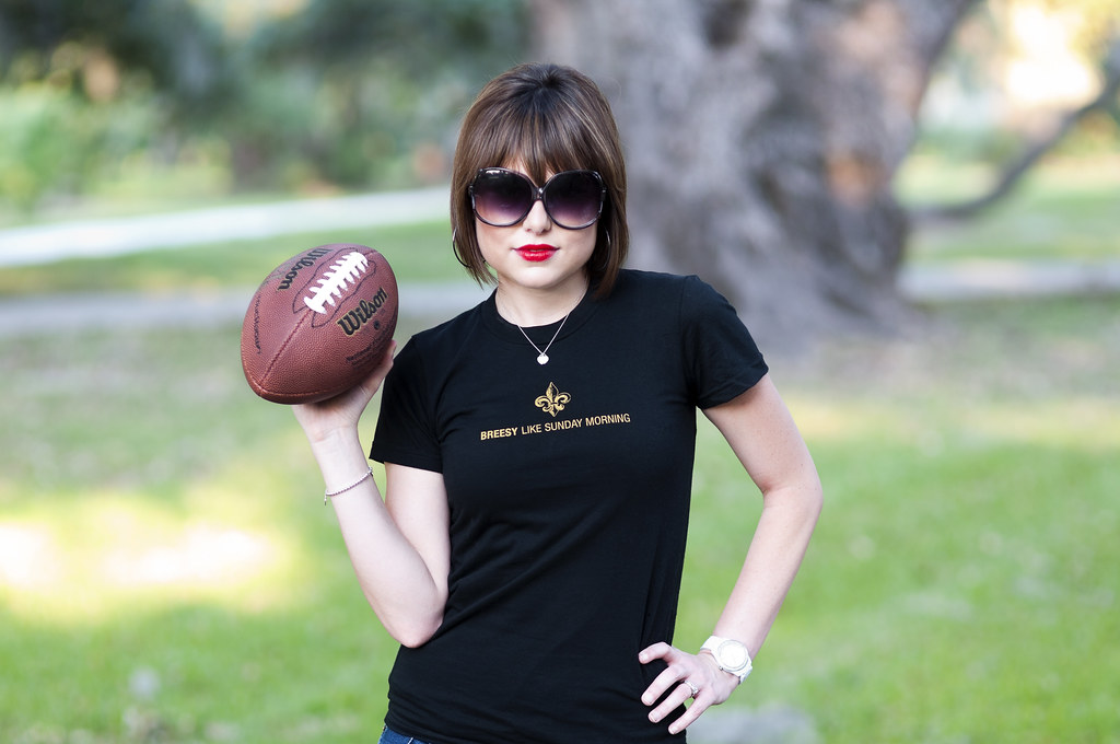
6151714777_963a9ca676_b.jpg


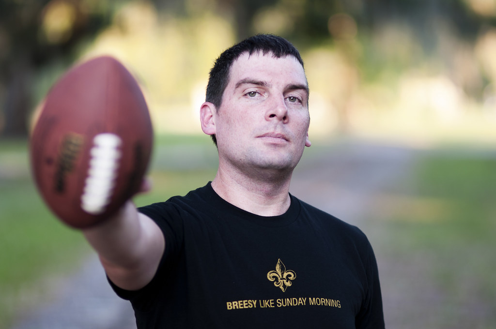
2. One of my motion blur shots :( Eyes definitely not as crisp as I wanted, but on their website, the images won't be this large so it might not be too bad. Definitely something I want to improve on though.
6151713209_31bcaa02c6_b.jpg


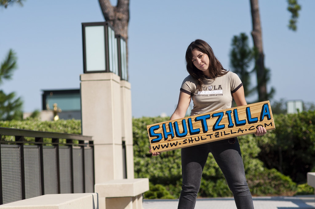
3. Also dealt with some that aren't used to 'modeling', so the uncomfortable'ness showed through in some of the images.
6152262714_6291e9ae7a_b.jpg


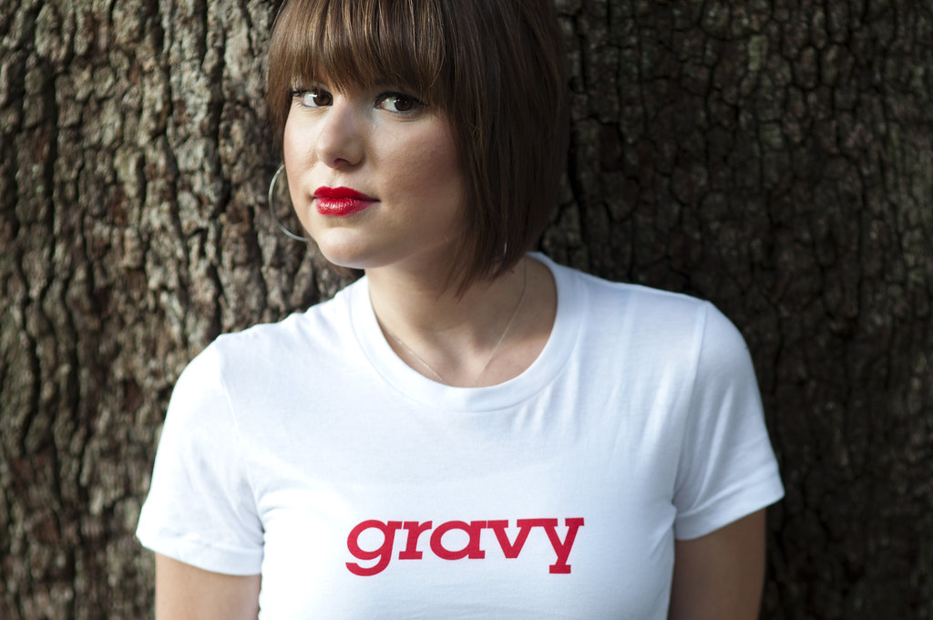
4. Top of head chopped off, but was done purposely.
6151712479_802828c8cb_b.jpg


5. Some more harsh lighting.
6151715635_bd15ba8255_b.jpg


Overall, not happy with my results, but the 'customer' is highly pleased with the way they came out. Not saying much, since they came from P&S shots before, but I'll take it as a learning experience. I told them, "Next time, we do 1 or 2 models and after 5 or 6 pm" lol.
 
That 85/1.4 images like krap...please send it to me and I will take it off your hands and ship you back an old 70-150mm f/3.5 zoom lens in exchange.
 
lol, I'm gonna pass man :)

Since I have your attention Derrel, any other opinions on the shots that I haven't already pointed out?
 
My first comment is that in general the text on the shirts isn't noticeable enough. I figure that the company wanted to get as much of the person in the shot as you captured, so they can convey the attitude of their prospective customers as much as what is on the shirt, but I think there is a time and a place (or rather, a shirt) for that. For example, "It's always humid in (something too small for me to read at TPF's default resolution)". Had he, maybe, been sitting down with his arm around the lion you could have zoomed in much closer, so that all the text was legible. Similarly, shot 1 doesn't work for me as much as shot 2 only because I couldn't easily read the text without enlarging it. Now, individually...

1. I can't believe I'm doing Derrel's dirty work for him, but I think this one would have worked much better in portrait orientation. The extra space on the sides adds nothing to the shot, and had you shot it vertically you would have captured her attitude while making the text more prominent. Great use of DoF to pop her from the background (though the background is still a bit busy - even cropping from the sides to make it more of a portrait orientation you would have grass, a tree, a path, and shrubs visible).

2. I like what you were trying to do with the pose with the football, but here I think your shallow DoF works against you. I get that you don't want the football to dominate the foreground and distract from the shirt, which it might if it were in sharp focus, but instead you have a distracting relatively large foreground blob. I'd also suggest cropping from the right. As it is you have his head and torso centered (generically boring), yet at the same time by having his right arm and football extend so close to the edge of frame the shot looks unbalanced.

3. I like that you moved her off center, and I actually like the lighting even with the relatively harsh shadows. I don't know if you shopped it or if it's the effect of that lighting, but the blue text on the sign just jumps off the screen. On the other hand, I can't read what is on the shirt, and all the surroundings add nothing to the image.

4. My favorite shot of the bunch, and a rule breaker. For me this one works being in landscape orientation, and centered at that. I think shooting it in portrait would lose some of the effect of the spacing of the red (the shirt text and her lips) and the angle to her shoulders. I think you could crop in from both sides to make this a square(ish) crop and not lose anything, but I think it's fine this way. Ironically, this would be the best shirt in the bunch to have done some of the full body shots, as it's the only one that is really legible from a distance.

5. I think I've already covered anything I have to say about this one...
 
Thanks for taking your time for the critique man. While I agree with you about the shirts being too far away and not legible, but these aren't the only shots of the bunch. We have about 3-5 shots per shirt, at different degrees of zoom/emphasis on the shirt. These are more of the 'play' shots that they wanted to go along with the regular stock images of the shirts. As far as Landscape vs Portrait, I couldn't agree more, but I had asked them prior to the shoot whether which orientation was preferred for their site. They chose Landscape for majority of their shots, so I was sort of stuck with the crappy lighting and the orientation lol.

For #3 and the color of the sign, that was all the work of the bright sunlight lol. I really didn't have much color correction to do on this shot, it nearly came straight out of the camera like this. That sign popped out like whoa!

#4, we definitely have full body shots of this shirt also. Check it, notice the popping blue color of the sign again lol. [AND the crappy lighting :)]
6152256956_e3a6a2348d_b.jpg


These are only 5 out of hundreds I shot of the day and only ones I chose to edit right away for a 'teaser' for them. I still have some work ahead of me though lol.
 
#4 is the only one that makes me actually pay attention to the shirt... in the rest, I'm drawn to other parts of the composition - the football for example, and the obnoxious sunglasses. I think many are too wide / busy to draw attention to the shirt itself, but I guess if they were in a catalog it may not make much difference.
 
I like gravy on the top


of my mash potato.... OOPS my bad ... bad joke.. thats your wife.
 
I'm slightly obsessed with your gorgeous wife.

That is all.
 
In a few of the photo's (1&5), it is difficult to see what the shirt says. And the second seems a little cool. I think the fourth is the best to show off the shirt.
 
I agree with most of Sudio7Four's critique. I understand about being "stuck" with a client preference- I try to convert the restriction to a challenge- it frees me creatively. For the "Gravy" shirt, I would have shot her using the lion statue as a lounger and the sign as a footrest- like she is sneaking a rest break of holding the sign- but is unaware she is lounging on a lion. The "Always Humid" shirt- I could see the model looking all sweaty and humid- in an action shot with the football- like he is thumbing his nose at the heat. If you set up the photo to tell the story of the shirt, reading the shirt becomes less important- at least to me. Looking forward to seeing more of your shots and I really like the look the sign.
 
In a few of the photo's (1&5), it is difficult to see what the shirt says. And the second seems a little cool. I think the fourth is the best to show off the shirt.

Thanks, I'll go back and adjust the temp a bit on that one. I noticed it too.

If you set up the photo to tell the story of the shirt, reading the shirt becomes less important- at least to me. Looking forward to seeing more of your shots and I really like the look the sign.

Isn't that defeating the purpose of showing off the shirt though? lol


Thanks for all the thoughts and critiques guys, really appreciate it. BUT, for everyone thats saying it's hard to read what the shirt says, did ya'll read the backstory or my explanations for the shots? These are just images of people wearing the shirt, there will be stock images of the shirt design as well, these are just 'extra' shots of the shirts. If they see the Yellow "it's always Humid" shirt in a stock image, then others wearing a yellow shirt with what seems like that design, is what the client wanted. Don't worry, the shirt will shown to the customer better in the stock images.
 
lol, I'm gonna pass man :)

Since I have your attention Derrel, any other opinions on the shots that I haven't already pointed out?

Okay, as requested, some opinions from me:1-more background on the sides of her than I'd like. Zoom in on that lovely lass with the football....I don't wanna' see those white lines in the background...clone 'em out. Get rid of those overexposed yellow blobs left center and upper right corner. "Shoulda' been a tall". The wide camera orientation just renders her, and the T-shirt's wording, smaller than if the camera had been held vertically, as Studio7Four mentioned above.

2-eh...his expression seems, well, odd. Cropping off 20% or so of the right hand side will really make the T-shirt text more of a focal point, and eliminates that distracting bright yellow blob in the background.


3- too much environment, not enough girl and sign. Good use of the natural high sun position. Wanna' be better able to, uh, see her, uh, T-shirt's text much more clearly, IYGMD.


4-T-shirt seems over-exposed. Not quite the most flattering angle for her face...makes her look a bit jowl-ish under the chin,and her posture seems not to match her expression; her bustline needs to be lifted and stuck out a bit more, shoulders back, to match that sultry,smoldering eye look. And yes, I know she's your wife, but you can't crop the bottom right on a woman's bustline...looks weird...and let's face it, these kinda' pics are selling, well, you know...sex appeal...

5-dynamic pose and composition. His head's a bit too close to the upper left corner--he needs just a bit more top space. Again, good use of natural, high sunlight! I think if you clone out the distractions in the lower right corner, this will have more "life" to it.


I went to their web site-and these pics are a step up from what was there yesterday.

The lens has nice background and foreground blur characteristics.
 
These really dont seem corporate enough for advertising purposes. This is a shirt company but the shirts are not stealing the show here. You are focusing on the people more then the merchandise. You might advise your friends to employ some professional models for the shoot. I would try using some non traditional kind of angles to. These are all straight forward kind of shots. Get crazy with the gravy yo!!!!
 

Create an account or login to comment

You must be a member in order to leave a comment

Create account

Create an account on our community. It's easy!

Log in

Already have an account? Log in here.

Back
Top Bottom