There are a few technical issues (exposure, wrinkled background, etc), but I'll try to restrict my comments to the maternity aspect since that's the focus of these shots (and you have a small window to try to shoot some more).
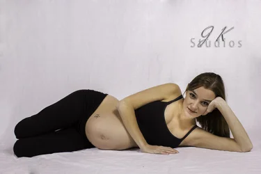
1) Personally I don't find lying down shots to be that flattering for a pregnant belly (either on the side like this or on her back), but that's largely personal preference. The two biggest issues with the pose in this shot IMO are that she's bent her legs back behind her - it looks like both legs have been amputated at the knees - and that her right arm is coming down exactly at the lower edge of her top. Since you can't see the transition from the black top to the bare belly it makes the upper and lower portions of her body appear disconnected and, more importantly for a maternity shot, it obscures the curve of the top part of the belly. This is basically a straight-on-to-the-belly shot, in which you don't get definition of the curve of the belly against the background, so you really want to emphasize any curve of the top and bottom and bottom of the belly against her clothing.
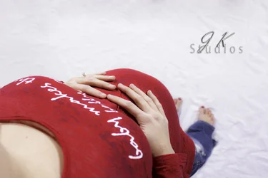
2) I really like the perspective of this one - it's a great angle to get definition of the belly curve as it stands out against the floor. The only drawback is that I'm guessing you shot this with a relatively wide lens - foreground objects are disproportionately large in comparison to far objects (her breasts in comparison to her feet). This unfortunately also relatively minimizes the belly. I think I might have cropped it just a little tighter, and you might play with her hand positions slightly so that her thumbs are visible, but overall there's a lot I like about this shot.
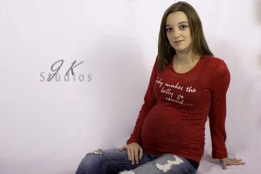
3) While there's nothing special about the pose per se, this angle is a good one for showing off the baby bump. Unfortunately her right arm, because it is dropped straight down against her body, prevents the curve of her belly from standing out against the white background. I think you could have gotten away with dropping that arm straight down behind her, propping her up as her left arm is doing; you could also have her try more model-y poses (that arm draped over her head).
On a side note, that red shirt is a really cute maternity shirt, but neither of these angles really plays it up well (I think shot 2 would work better without the white text drawing attention to her breasts, while in shot 3 the text is small and angled enough that, though readable, it's more of a distraction than a focal point). This is one of the rare cases in which I'd recommend a straight on shot. If you feel like reshooting her in it, you might try straight on with a tight crop so that the shot is really just her torso. You can either roll up or bunch up the shirt so it lies across the top of her bare belly, or you could keep the shirt down and you some dramatic side lighting to really emphasize the curve while still making the text relevant.
Congratulations to you and your fiancee! She looks great for as far along as I'm guessing she is!



 ).
).