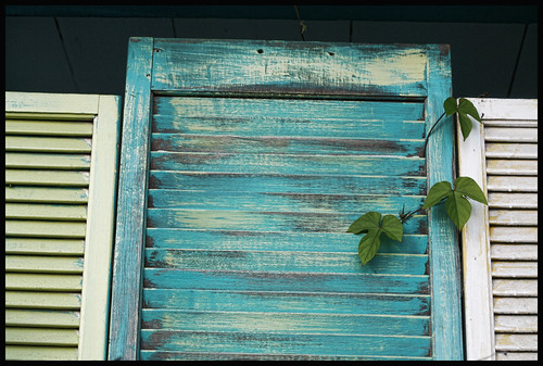
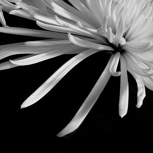
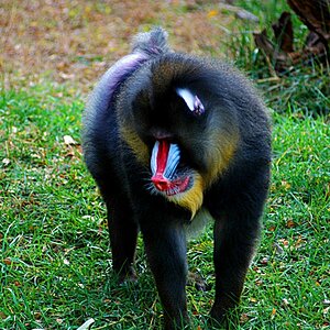
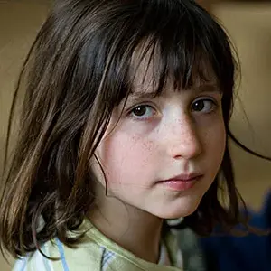
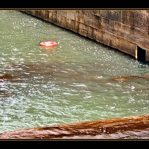
Textures are nice when they're juxtaposed or contrasted with other textures. I see an opportunity for that in #4 with the leaf, but it's too far zoomed out to get an idea of the leaf vs shutter, and there's too many other elements in the frame.
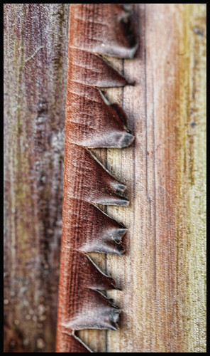
#2 is zoomed in nicely, but I don't like the OOF areas.
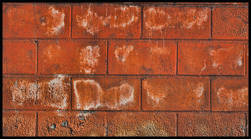
#1 has the focus, but I'm missing a secondary supporting texture. Also, I'm not clear on why you framed the brick pattern the way you did. Some areas cut off at the joints and some not quite at the joints. Also, the image leans to the right.
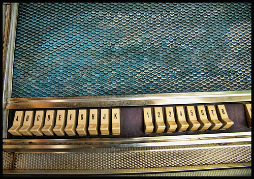
There's lots of texture in #3 to play with... from shiney to dull to bumpy etc... but the composition doesn't jive with me.