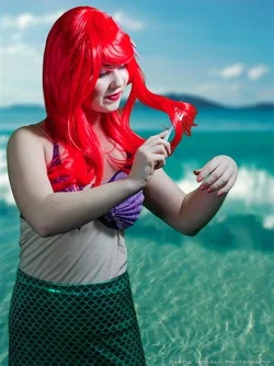
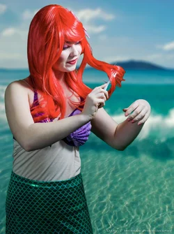
unfortunately, there's nothing about these I like: the pose, the lighting, the post work...
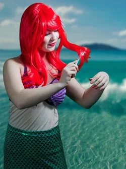
The pose is causing her body to rotate and her fake skin to wrinkle. You can barely see her face. Her hand is held out weird. Something like this could have been more flattering:
http://www.femor.co/wp-content/uploads/2012/10/hair-combing.jpg It's dreamy, allows you to see her face, and matches the character.
The background perspective in relation to the subject is wrong. You shot her from slightly below eye level, yet the backdrop looks like it's above eye level. This ruins the illusion for me.
The lighting is really harsh--it's blowing out her skin and causing deep shadows--plus, you are losing tons of information in her hair where it's just a red blob by her eyes. It was positioned up high so he torso is not evenly lit. You've been trending on overexposing faces lately, I think you should really focus on this. I would have moved the light source much closer, used a reflector or fill, and a rim light.
The post is poor. Her WB is off, she appears white/green (another trend), there's no natural color to her; regardless of her being a mythical creature. Since the lightning was so harsh, and you didn't use rim light, you had a tough time cutting out the background--there's a harsh black outline around her. It's very apparent around her hair. Had a rim light been used, the edge around her would have been lighter and more natural looking, not to mention more clearly defined to be able to use the pen tool on.
My suggestion is spend more time on the technical skill of taking pictures as opposed to working in post one little nit-pick at a time hoping to save the image.









![[No title]](/data/xfmg/thumbnail/41/41924-6ae94add98501b0c7ebd13870b86cf70.jpg?1734176284)