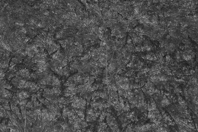
Instead, this example, which I intensionally sought an image with no composition or center of interest at all.
When someone looks at a picture, somewhere in their mind there is a little
vision engine that tries to parse out what all the things are in each picture, what their relative importance is and what is the meaning of the picture being shown to them.
The role of the photographer is not to follow rules but to present an image that is structured in such a way that the viewer can absorb or appreciate it. (except of course for the example above in which there was a determined wish to not do that.

)
Since, in the Western world at least, we seem to inherent some little set of ways in which we parse meanings by size, by color, by brightness, by position- even an untutored person can appreciate some pictures. As people look at more pictures, they form their own set of likes and dislikes, but usually based on a fairly common underlying set of built-in ideas. For example, bright colored things are important, important things are not in the center exactly and not way over on the edge usually, things in the center sort of imply a symmetry. We like balance, it feels good, we are attracted to things that are 'in focus'.
These ideas and presets that seem to be built into most people are sort of described, awkwardly by the 'Rules.'
Photographers can use these preconceptions by violating them and giving that extra fillip of interest.
So critiques ar most helpful, not if you tell the maker what you think diminishes the impact, but why that the 'defect'
does diminish the effect. THat helps people to understand what to do and why to do it.


")