What's new

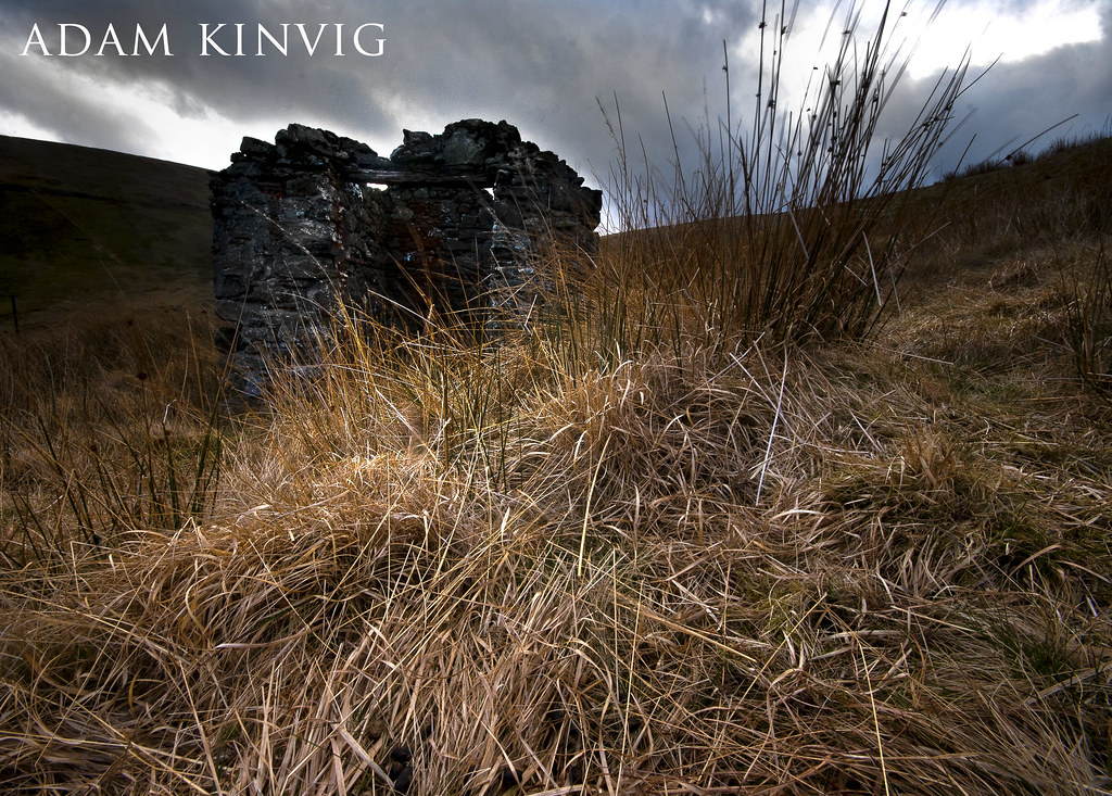
The tiny derelict structure

AdamK

TPF Noob!
Joined
Oct 7, 2010
Messages
212
Reaction score
5
Location
Isle of Man
Can others edit my Photos
Photos NOT OK to edit
Hi guys, I went out to the Snaefell mines were 20 men died in 1897.
I am not too sure what this building is about because I could just get in it and I am not the fattest nor the tallest person in the world!

C&C would be very kind of you, thanks for looking :mrgreen:
 
Please comment, I would love to know peoples thoughts and opinions. good or bad! :hug::
 
hmmm, I really like the shot in general, but since you're asking for response - my first thought was it was a rock, I only saw the 'building' after close examination, and wouldn't have looked that close if you hadn't instructed that is WAS a building.

I think the shadows on the front of the 'building' need to brought out so it's recognizable. And the top left may have been burned a little too much. I don't know the terminology I'm looking for here, but there is an obvious burning in and makes the focus of the pic the grass, and not sure that's real effective. I think more light on the building and grass would give better contrast to the GREAT sky you captured.
 
initially upon viewing the image, my eyes were immediately attracted to the lit part of the grass in front, and i kind of missed out on the structure in the background since it's not lit up as much. maybe if you apply some burn on the grass just a bit and put some fill light onto the structure in photoshop, it would be even better. great angle though :thumbup:
 
hmmm, I really like the shot in general, but since you're asking for response - my first thought was it was a rock, I only saw the 'building' after close examination, and wouldn't have looked that close if you hadn't instructed that is WAS a building.

I think the shadows on the front of the 'building' need to brought out so it's recognizable. And the top left may have been burned a little too much. I don't know the terminology I'm looking for here, but there is an obvious burning in and makes the focus of the pic the grass, and not sure that's real effective. I think more light on the building and grass would give better contrast to the GREAT sky you captured.

Sorry for asking :guilty: But would bringing the building out make the image less dramatic? But yeah the grass is a little bright so I could fix that.

In my mind the sky was just a backdrop for the lighting effect not the subject, with the raw image the grass was brighter than the building so I made that pop a little with burning and dodging, the initial idea was the grass to lead to the building then the buildings strange structure to capture the eye but I guess that didn't work :( Thanks anyway!
 
initially upon viewing the image, my eyes were immediately attracted to the lit part of the grass in front, and i kind of missed out on the structure in the background since it's not lit up as much. maybe if you apply some burn on the grass just a bit and put some fill light onto the structure in photoshop, it would be even better. great angle though :thumbup:
I was using the grass as a draw in line to the building, but I must of missed that shot with the lighting, I will give it a go and see if I like it, I shall post the picture up tomorrow. Thanks, I lent in animal feces getting this shot which was unpleasant to say the least :P
 
I think you captured from the best angle, and you don't really need to use burning/dodging to direct the eye to the building. Your lead in is the grass, not the light on the grass. So the same shot with no burning would be just as effective imo. The way the background fades so dark keeps you looking at the grass, which while it's razor sharp, it's not much of a focal point.

on the other hand, JUST using more fill light on the building with the current burned background may work just as well. I just think something needs to be done to open it up a bit.
 
The subject appears to be the grass, not the building.
 
DSC06025_2.jpg

Is this any better?
 
Your composition makes the foreground grass the primary subject. It takes up at least 50% of the frame. The structure is what, 20% at best? Lightening it up just made it more of a distraction to me.
 
i have seen your other work, this one doesnt belong with the rest LOL.
 
i have seen your other work, this one doesnt belong with the rest LOL.

I just checked Adam's website - WOW - definitely worth looking at!

Thankyou! I think I will call this image a failure and I will do better next time, just need to get in the spirit of photography again and remember all my little secrets I had! :lol:
 
Adam is a good example of "It is the photographer not the camera". Sorry adam, I dont mean to talk $hit about your equipment, but you get kick ass images from that sony A230! From now on when there is a noob complaining about their pictures with their consumer camera I am going to link them to your website. Keep up the good work!
 

Create an account or login to comment

You must be a member in order to leave a comment

Create account

Create an account on our community. It's easy!

Log in

Already have an account? Log in here.

Back
Top Bottom