This failed....why?

there coo photos, nothing wrong with the execution but the concept eh, i don't like the black background, it brings sorta of a evilish tone to the picture like their crazy.
 
Here is my over the top PP version. I went for the dark yet glowing glamour look. I made her cheeks a bit too puffy/full which made her eyes small. But kinda cute I guess. I don't particularly like the look, but she will. lol. Many seem to like this sort of look. I thought it died in the late 90's. lol


8395643283_0d2557f5f9_c.jpg
 
Last edited:
there coo photos, nothing wrong with the execution but the concept eh, i don't like the black background, it brings sorta of a evilish tone to the picture like their crazy.

Thanks for the comment.

I have a few where he looks really evil, and was not intentional. lol, sort of a Jack Nicholson "One flew over the coo coos nest" look. lol

In hindsight, I think really, just adjusting reflector better and lighting the back better would have made the difference for me.
 
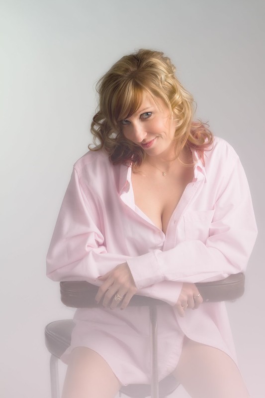
Here's a different shot. A bit more racy. I have not decided what to do with it yet, which way I want to go. I wanted a bit messy hair look, but still nice. It sorta frumped up at the top back and I didn't catch it. The first image is straight raw to jpg conversion with nothing done yet. Second is a quick little pink (from the shirt) gradient overlay I wanted to try to see if I liked the effect for further toying with. Still undecided what to do with it...but I'll figure it out. lol


8396740388_2e85b78400_c.jpg


8389657315_8579571808_c.jpg
 
Is the angle not "goofy" looking to anyone? I thought maybe I had the camera too high...but for some reason I wanted that sort of angle. I think if she had her hair down it would not look funny to me..maybe. lol

I suck so bad at poses....I can't wait until I finally learn it. lolol

The first pose of just her is really cute. The couples pose is lacking a connection between the two of them and is making her look bigger than him. Which of coarse you don't want to do. Have you tried just searching Pinterest for posing ideas? Here are all of my posing boards. Kathy Thorson (kathythorson) on Pinterest

Very awesome pinterest thingy. Thanks for sharing that. I did not see any pinup style. Do you do, or have anything to share on pinup? I am shooting this same woman for a pinup shoot next weekend, so I'll be prepping for it this week. Her husband is a drummer in the band I shoot and they want a nice set, as well as a main image to have put on his bass drum. I have 2 poses in mind for the drum shot, the rest will be fun and artistic experimentation. We have already gone over wardrobe and such in our consultation. Basic classic pinup is what we are doing, with PP in old vintage style.

Yeah I searched the net etc and used samples of my last pinup shoot, but I really like your pinterest thing so I thought I'd pick your brain.


Feel free to PM me anything you'd care to share.

Thanks.
 
In your edit of the first image her skin does look better...to an extent, and then it looks a bit overdone like you said. I think that I would leave the bags under the eyes but try and lessen them either by dodging or lightly cloning the surrounding areas. Without any bags she looks like she's wearing a Photoshop mask lol.


It also looks a tad magenta, but other than that it looks fine to me.

The only real thing that stuck out to me in the original was how close her shoulder is to the edge of the frame. I don't want to be all "you must follow all the rules all the time", but I just want to push her farther into the frame or pull the camera back a little bit, heh.

Thanks for chiming in Rex. Yeah it was over the top as stated. I will most likely end up doing also a basic version, like Robin did, with just dodging the bags a bit to lessen them a bit.

Women are weird, they like the mask. lol. She said "make sure you make my skin awesome and smooth" I was like "your skin is fine" lol. Women...*shakes head*

I thougth the same with the magenta, but I don't want to argue with my monitors tonight so I'll make final corrections on system at work and print test, thank God I get free prints to test on. lol.

On the shoulder thing. I thought the same, but was trying to mimick what I saw in the learning video with that post. They did the same, and it looked good. So I cannot take credit for the pose...good or bad...as I basically copied it from the video. I think, if I remember right, they had more actually chopped off, I left a sliver of backdrop there, so I think I'd need to either leave more room or chop more...not really how it is now. I don't think I cropped that one...or if I did it was a tad, so I pretty much tried to frame as they cropped.

Trying to take my blinders off and just shoot things I normally wouldn't on this whole series with her and her hubby to 1 practice lighting more, and 2 posing more. Learning how to deal with people and put them where you want them, I see, is just going to be one of those things I can't rush and will take time and practice to get the hang of.
 
The catchlights in the eyes are dull to non-existant, which is certainly part of the problem.

Not very helpful. What's your idea on correcting that issue you pointed out?

Generally, it means the light should be closer to the subject, at a correspondingly lower power to maintain the same fstop.

For the bags under the eyes, concealer a shade lighter than the skintone in the dark crease, covered w/ foundation. And don't be afraid to clone it out in PS.

Maybe add a background light just to give variation and dimension to the background. While I'm (barely) ok with it as is in the first one, the second shot is begging for a snooted background light, and maybe even a gridded hair/rim light from the rear.

In the second shot, he seems to be forgotten about, lost behind her hair and grinning madly in an emasculated I'm still here kinda way. Maybe turning her shoulders to face him and having them more cheek to cheek would resolve that. Or moving her behind him (while more traditional) would maybe work better.
 
Is the angle not "goofy" looking to anyone? I thought maybe I had the camera too high...but for some reason I wanted that sort of angle. I think if she had her hair down it would not look funny to me..maybe. lol

I suck so bad at poses....I can't wait until I finally learn it. lolol

the camera was a little high, but all you had to do was have her raise her chin a little to face into the camera. That would also have pulled the pupils back towards center, which may have helped, or may have lost the fun flirty expression.
 
Keep in mind I really only post my bad stuff and fails on here. It's how I learn. I don't post the good ones up often. I have a few that show connection with them and that sort. But no need to put 'em up as there are no major flaws I cannot recognize to learn from. ;-)

you'd be surprised what major flaws these people can find in your best work. ;-)
 
The catchlights in the eyes are dull to non-existant, which is certainly part of the problem.

Not very helpful. What's your idea on correcting that issue you pointed out?

Generally, it means the light should be closer to the subject, at a correspondingly lower power to maintain the same fstop.

For the bags under the eyes, concealer a shade lighter than the skintone in the dark crease, covered w/ foundation. And don't be afraid to clone it out in PS.

Maybe add a background light just to give variation and dimension to the background. While I'm (barely) ok with it as is in the first one, the second shot is begging for a snooted background light, and maybe even a gridded hair/rim light from the rear.

In the second shot, he seems to be forgotten about, lost behind her hair and grinning madly in an emasculated I'm still here kinda way. Maybe turning her shoulders to face him and having them more cheek to cheek would resolve that. Or moving her behind him (while more traditional) would maybe work better.

Very helpful tips. Thank you for taking the time to respond so detailed. :)
 
The catchlights in the eyes are dull to non-existant, which is certainly part of the problem.

Not very helpful. What's your idea on correcting that issue you pointed out?

Sorry, not really a lighting expert so I wouldn't want to start giving advice on how to fix it. I see you got some, though.

Your OP sounded like you were having trouble seeing what was wrong (which happens to all of us, I didn't take it as a negative at all), and were looking for some help on that, from some fresh eyes. I can "see" pretty well, sometimes, so I contributed what I could. I apologize if I misunderstood your original request.
 
Here is my over the top PP version. I went for the dark yet glowing glamour look. I made her cheeks a bit too puffy/full which made her eyes small. But kinda cute I guess. I don't particularly like the look, but she will. lol. Many seem to like this sort of look. I thought it died in the late 90's. lol


8395643283_0d2557f5f9_c.jpg


yea thts a lot better, good fix imo
 
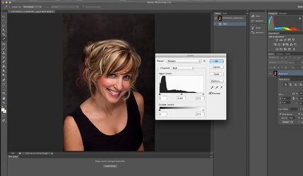
$Screen Shot 2013-01-19 at 7.55.12 PM.jpg

Look at the histogram for this image .... since the background is black one would expect the stack to heap up on the left side but there is little white and the mid tone is flat ... open it up a little and see the difference, keep the blacks black and just adjust the mid and highlight.
 

Most reactions

New Topics

Back
Top