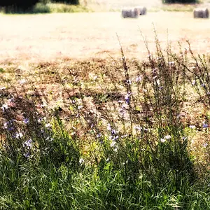
I like the idea behind the third one but I'm getting a bulleye's feel from it. The split in the tree and horizon behind it and the tree itself are all centered or very close to it. I wonder if cropping out some of the dark foreground and little off one side (left) would improve the composition a little. Just my 2 bits.






![[No title]](/data/xfmg/thumbnail/36/36667-b3265abf8272f21d759a0abd6a0995c3.jpg?1734169172)

![[No title]](/data/xfmg/thumbnail/33/33873-e4eab8f61d68a145e3b86b7a7fca6372.jpg?1734164217)