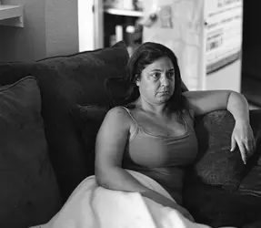
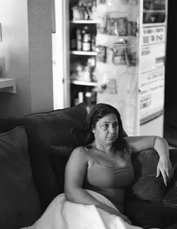
The second one l
ooks like a 4x5 film image
because that's what it is...very shallow depth of field, punctuated by patches in crisp focus, with tremendous fine detail and texture revealed in the areas that are in the depth of field plane. It also has dust and lint on it, and looks like a film scan that has not been cleaned up. I looked at the second on in PS...the scan has a lot of lint on it, plus dust.
The thing about 4x5 is that there is tremendous detail, and the capture is BIG, so the depth of field at this close a range is very shallow. f/11 is a pretty wide aperture for 4x5 at THIS distance...her face is in focus, as is her left hand, and the upper part of her right shoulder and upper arm...and then the depth of field slides into defocus...her right arm, and the blanket she's got on her lap are OOF. You have one side of her chest in focus, the other is out of focus.This is a very common "look" to large format shots done without the camera's movements being used to "place" the focus band...what it does is creates some interesting visual variety...one couch pillow on the left is OOF...her arm is OOF, but the face is sharp...there are multiple in-focus and out of focus areas that are physically close to one another, due to the simple geometrics of the couch, and the camera's relation to the couch...this is what larger format images look like when the camera is shot at wide f/stops from close range...and f/11 is "wide-ish"...especially with no movements. This might be the "glow" or the "book-like" vibe you sense.

A. spotted for dust, then sharpened with USM.
I took the original you put up, a small scan of only 2100 x 2721 pixels, and cropped it in about half, then spent 20+ minutes cleaning up the dust and fibers to get to this, which by the way, has an oddball 20% dot gain profile, so it looks kind of gray. Photo A was sharpened, four times, each time at 100%, .3 pixel radius, threshold of 0, then each pass faded to 40%, including the last one.

B. blanket,chest,right arm sharpened and faded, and then size reduced to 1,575 x wide.

C.photo B as above, but instead of the 20% dot gain, a Gradient Map was applied, which is the way I do a lot of my Photoshop B&W stuff.
 ... Those really were the days)


![[No title]](/data/xfmg/thumbnail/39/39420-c7c6e6f01cdeeceeb81ee717b24dd629.jpg?1734173503)


