
tmkc
TPF Noob!
- Joined
- Sep 3, 2010
- Messages
- 15
- Reaction score
- 0
- Location
- florida
- Can others edit my Photos
- Photos OK to edit
This is my first time trying this so be gentle-ish")
There are a number of these, so if you could just make suggestions for each, I'd appreciate...also, which do you think is the best of the bunch?
2,3 are with a Novatron
1,4 are outside
5 is with my new speedlite flash
1.

2.

3.

4.

5.

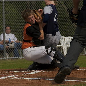
Gonna throw one non-baby in also...does he look too angry here?
THoughts on composition, this is with the speedlite outside on a cloudy day...needed speedlite cause his eyes have major shadows...
6.

There are a number of these, so if you could just make suggestions for each, I'd appreciate...also, which do you think is the best of the bunch?
2,3 are with a Novatron
1,4 are outside
5 is with my new speedlite flash
1.
2.
3.
4.
5.
Gonna throw one non-baby in also...does he look too angry here?
THoughts on composition, this is with the speedlite outside on a cloudy day...needed speedlite cause his eyes have major shadows...
6.
Last edited:
![[No title]](/data/xfmg/thumbnail/32/32718-19d5f7764b6f43f6cec5a67701261560.jpg?1619735624)

![[No title]](/data/xfmg/thumbnail/32/32716-bd7f0a0030263f160d995f8547043458.jpg?1619735621)
![[No title]](/data/xfmg/thumbnail/38/38726-c2f92932ae847f22fd6548bf87263976.jpg?1619738702)