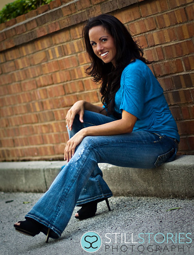
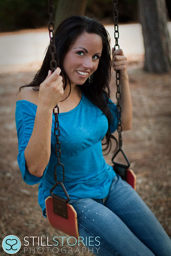
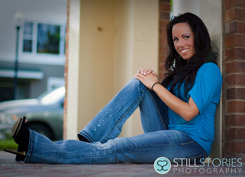
I think you're going just a bit too far on your use of vignetting, which is causing color shifts on the corners of your photos. I looked at the web site, and the one cute photo of the baby in the back of a wooden-sided wagon for example has a lot of vignetting at the upper right corner, and I see the same here in shot 3.
On shot #1, the lightest and brightest area happens to be her hands. Like the old design adage, "light advances, dark recedes," the vignetting of the outer edge of frame 1 makes her hands "advance". Same with her brilliantly white teeth and very dark makeup...the contrast between her pearly whites and her dark,drawn-on eyebrows makes this set look very,well, unsettling to me. The attempt at retouching that somebody did, that brings her makeup tones more in line with her tanned arms looks better.
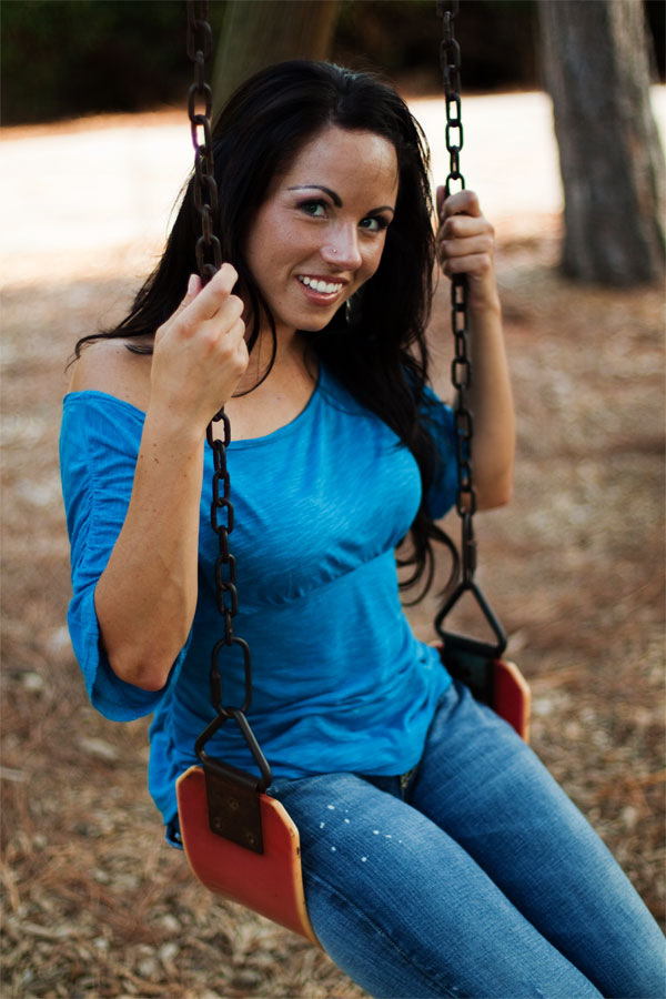
I can tell this woman has a vivacious personality, but as a photographic subject, her combination of characteristics makes these photos less than stellar as portfolio examples in my opinion. I hate to make a comment like that on-line, but it's how I feel. I also think that in the enlarged,retouched version of the swing set photo, the bokeh of the lens you were using looks very jarring, like it was shot with the 50/1.8, which has that 5-sided aperture and which gives a "vibrating" feeling to backgrounds that are outside the depth of field zone.







![[No title]](/data/xfmg/thumbnail/35/35932-28690c4fc247cf491230e47fc70ebeb5.jpg?1734167727)


![[No title]](/data/xfmg/thumbnail/32/32810-094482c1ef1c76eae62a96107013a72e.jpg?1734162496)


![[No title]](/data/xfmg/thumbnail/32/32808-9d1f657a1903d3bdbd67ea830397d62c.jpg?1734162491)