Straight on is usually bad. Walker Evans managed it with surprising success, but he was usually showing us stuff in FRONT of the building more than the building.
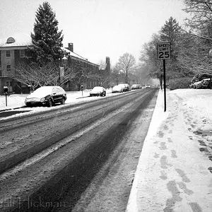
Get to the side and turn those horizontal lines into diagonal ones, visually. In an ideal world, you make the diagonals hit a "vanishing point" that's in the frame rather than outside of it.
Keep the frame simple, but give us a little context and some little details to look at. Get some light on there, get some shadow on there. The angled view also gives you two sides in view, so at the very least one can be placed in shadow while the other is lit. If you can get a good shadow on the face of the building, maybe from a building across the street, that's a good idea too -- a nice balance of sunlight and shadow over the face of the building can give some visual interest.



 lol!
lol!