What's new

Todays Photo Shoot C& C

revenater

TPF Noob!
Joined
Nov 28, 2011
Messages
261
Reaction score
22
Location
Rogers AR
Can others edit my Photos
Photos OK to edit
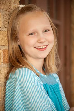
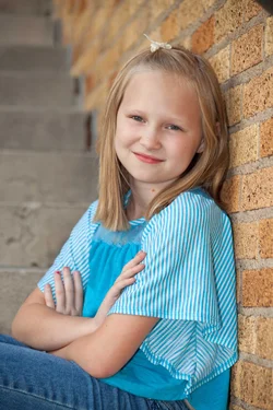
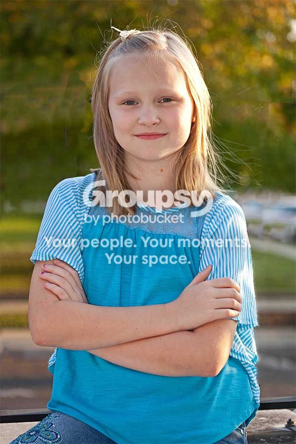
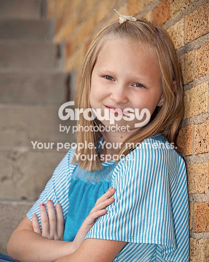
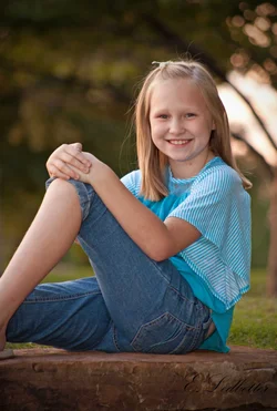
So it had been a while since I did any portrait so I decided I was doing some today.....so my model is my beautiful 10 year old daughter. These are my favorites, Please let me know what you think.
1. $image1small.webp
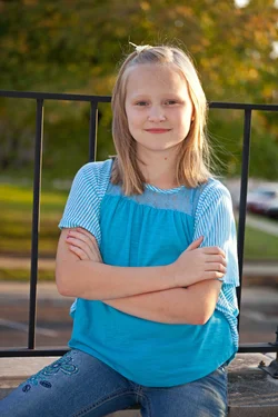
2.$image2small.webp
3.$image3small.webp
 
I cannot believe no has anything to say.......I was really hoping for some critiquing. I am really trying to improve.
 
I am just a newbie..... but IMO #1 could of used some fill light on her face. #3 seems a bit underexposed. #2 looks great to me! Nice catchlights in her eyes.:)
Oh also I'm going to add (what everyone always tells me....) your subject is really centered. The rule of 3rds means alot to alot of people. My preference is centering things so I still need to work on that myself.
 
These are ok. The bar going right through her head bothers me a lot though. I like 3 the best with the brick and stairs. If people dont comment, sometimes that means "meh, ok shots, not great, not bad".
 
I'm new here, but want to add my opinion anyway, I think you got the light just right (maybe too right!) but although she's smiling her crosse arms shows she's not really confortable, and the fence into her head is also a bit disturbing!

My 2 cents...
 
I like Photo 3 the best of the series. She's placed nicely, the light looks good in my eyes, and I like the expression of defiance ("No, I'm not going to do ALL you say, dad") which may or may not describe her just right? The second is nice, too, a little yellowish-red (reflection from the bricks?), but the first has the issues going on that have been mentioned before.
 
i like your depth of field and the expression of your daughter in the 2nd photo is probably the most natural. not that the other 2 are bad. i guess what everyones getting at is to consider your composition a bit more. good try though.
 
one would be great with a fill flash and no rail in the background
two I like a lot but a little fill may help it
three only needed a joke to get s real smile it looks very nice all round
 
#1 nice picture of a sweet girl, pretty good expression, light could be a bit better less glary. small nit, I would remove the fence, upright her a bit, sharpen a bit to give a little local contrast enhancement and center her in the field. She is face on and it looks off balance to me.

#2 the on-camera flash makes her skin flat and atonal, I would toss it.

#3 She's in a cozy pose but the 4 x 6 leaves a lot of space. I would crop to 4 x 5 and warm a tiny bit.

image1smalllllll.jpg


image3smalllll.jpg
 
2 and 3 are nice.
#1 is just a snapshot of your daughter.

I'm not a portrait guy and I don't know anything about lighting but something doesn't look quite right with the lighting..
 
the background in 1 'kills' the shot (in a professional way). #3 is great though! I like the tighter crop that lew did on it :)
 
Thank you all for your comments I agree with the fence looking back I would have done something different. The last one is my keeper from the set and I agree with the tighter crop I like that better also. I used a softbox on my canon flash hoping to help keep it from looking flat but I see what you mean about light in number 2. Here is one more that I got that night is it worth keeping?
 

Attachments

  • $vadaweb.webp
    $vadaweb.webp
    904.1 KB · Views: 143
This is the best of the set.
 

Create an account or login to comment

You must be a member in order to leave a comment

Create account

Create an account on our community. It's easy!

Log in

Already have an account? Log in here.

New Topics

Back
Top Bottom