Tom B; a simple portrait

tirediron

Watch the Birdy!
Staff member
Supporting Member
Joined
Jul 8, 2005
Messages
45,747
Reaction score
14,806
Location
Victoria, BC
Website
www.johnsphotography.ca
Can others edit my Photos
Photos OK to edit
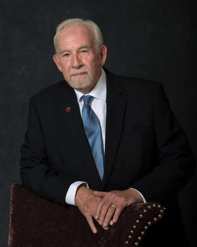
An image from the "portrait booth", part of the coverage I provided for Tom and his wife's anniversary celebration recently. As always, comments, critique and suggestions appreciated.

TomB.jpg
 
Looks good. I might brighten the right side very slightly so his suit doesn't blend into the background but otherwise, a good image to have printed and placed on the mantle.
 
Looks good. I might brighten the right side very slightly so his suit doesn't blend into the background but otherwise, a good image to have printed and placed on the mantle.
Thanks Rex - I considered that, but I actually like that "fading out of the background" look (you will see it in a lot of my studio work).
 
Tom be looking good! :smile:
 
Excellent portrait. I do find my eye drawn directly to the red button. If not important to the image I might eliminate it.
 
As always excellent work!! I also like "that fading out of the background look". So much so, that I've incorporated the idea into some of my studio shots (hope you don't mind). As to the negatives like Donde above the pin is somewhat distracting, but I suspect it has significance for the subject. The other thing is the little finger being askew, it looks slightly odd.
 
Fantastic work as usual! Great tones, and the posing suits the subject nicely. I like the dark the background, it doesn’t look like he’s fading on my screen, but I’ve always like the black on black look as well.

My only nit pick would be maybe giving him a little more room on camera right, so that if/when this is printed and framed, his elbow doesn’t get cut off in the process.
 
Looks good for lighting and pose. Great subtle colors. I don’t mind the button. I’d like it better with eye contact but I seem to be alone in that. In strong formal portraits, for me, eye contact is important.
 
as usual, a superb formal portrait.
the one nitpic (and one i KNOW i would have missed myself until i posted it) is that the tie is messy.
even leaning which makes the dress shirt uneven, the tie could have still been flattened out.
a minor niggle at best.
i love the black on black! (its certainly one of my favorite styles)
 
I also would like greater detail in the blacks and a bit of isolation from the background. To my eye, I would rather have the head centered than the hands. But it is another very nice portrait. Tom B. will be pleased.
 
Tom be looking good! :smile:
I'll be happy if I can look half that good at 85!

Excellent portrait. I do find my eye drawn directly to the red button. If not important to the image I might eliminate it.
Thanks! It does have meaning to him, so for that reason it has to stay...

As always excellent work!! I also like "that fading out of the background look". So much so, that I've incorporated the idea into some of my studio shots (hope you don't mind). As to the negatives like Donde above the pin is somewhat distracting, but I suspect it has significance for the subject. The other thing is the little finger being askew, it looks slightly odd.
I'm very flattered that you'd use my work as an example. I agree that the finger is distracting, but unfortunately it wasn't movable.

Fantastic work as usual! Great tones, and the posing suits the subject nicely. I like the dark the background, it doesn’t look like he’s fading on my screen, but I’ve always like the black on black look as well.

My only nit pick would be maybe giving him a little more room on camera right, so that if/when this is printed and framed, his elbow doesn’t get cut off in the process.
Thanks Jazzie - you're right, it is a bit cramped on the RH side, and I probably will add a bit of space there.

Great shot as always.
Thanks Logan! :)

Looks good for lighting and pose. Great subtle colors. I don’t mind the button. I’d like it better with eye contact but I seem to be alone in that. In strong formal portraits, for me, eye contact is important.
Thank-you. Good point on the eyes, they're my personal nit with this image as well.

as usual, a superb formal portrait.
the one nitpic (and one i KNOW i would have missed myself until i posted it) is that the tie is messy.
even leaning which makes the dress shirt uneven, the tie could have still been flattened out.
a minor niggle at best.
i love the black on black! (its certainly one of my favorite styles)
Thanks... TBH, I didn't catch the tie and I should have.

I also would like greater detail in the blacks and a bit of isolation from the background. To my eye, I would rather have the head centered than the hands. But it is another very nice portrait. Tom B. will be pleased.
Thanks Gary! I actually tried to have the middle of the head and the middle of the hands approximately equally offset from the edge; not sure how close I came...
 
Beautifully done.

I usually notice things like the tie but I think I was looking at his face and eyes, it's a wonderful capture of his personality. I feel like there's a little gleam in his eyes and a hint of a smile under the surface.

And the pin being a maple leaf, yeah I'm sure it's part of the portrait and meant to be noticed.
 
I hope to still be breathing when I'm 85. My looks were never good anyway.
Nice as always my Canadian brother
 
Well I see that the tie is twisted, his pinky on his right hand is stuck out there by itself and I think there are a couple of fly-away hairs that are out of place...... NOT!!!

Looks good to me. Simple setup. The only thing that I would say is it would be nice to have a kiss of light on the shoulders to separate him, but it's not a deal breaker.
 

Most reactions

New Topics

Back
Top