Mandolin
TPF Noob!
- Joined
- Jun 3, 2014
- Messages
- 84
- Reaction score
- 77
- Location
- Shores of Lake Erie
- Can others edit my Photos
- Photos OK to edit
On the rare occasion he wants his picture taken, my little man's a star. No mom bias here 
Natural light, no fill (obvs), slight crop. CC welcomed!
http://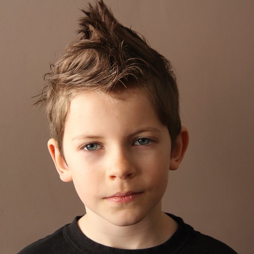 tyler punk by MandolinPics, on Flickr
Natural light, no fill (obvs), slight crop. CC welcomed!
http://
tyler punk by MandolinPics, on Flickr