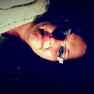
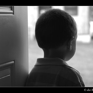
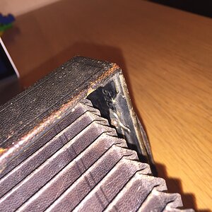
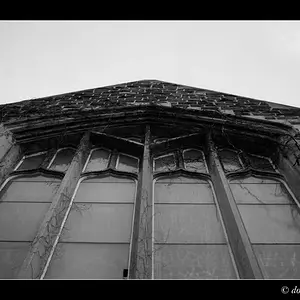
I like them all.
Not sure whats up with the color tint in the train pics, could be my monitor. Raccoon eye in the last pic.
In the last set of pics #1 and #2 appear to have a lot of wasted pixels with all that dark space. If you were leaving room for text or something seems understandable.
Pics #2 and #3 in the last set have a lot of distractions from the subject. The 1st thing that hits my eyes is the dirty brick, perhaps pick the rock up or toss it.
In pic +1 and #2 the bokeh lights seem to be more of a distraction than an asset. I might've spot tool removed them real quick.
Disclaimer: i'm a photo student, don't pay this nooB any mind whatsoever =)



![[No title]](/data/xfmg/thumbnail/33/33353-b10d15026a6a614f240c0bd4ee0fe22c.jpg?1734163270)