Trapped in Chaos

PixelRabbit

A naughty little bunny...
Joined
Nov 28, 2011
Messages
6,593
Reaction score
3,719
Location
Ontario
Can others edit my Photos
Photos NOT OK to edit
Definitely not everyone's cup of tea, I was trying to catch the chaos of the wind and was quite surprised and pleased with what I see in this one, it expresses some of my feelings very well.

I tried a few different ways to simplify the lines a bit and I liked how this turned out. Would love to hear your thoughts! Thanks for taking a look.


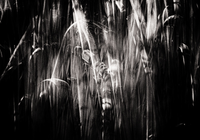
Trapped in Chaos by Judi Smelko, on Flickr
 
I will add my 2p just to bump it for further comments, since I think it merits some.. Can not say anything constructive myself, because to me this image is stuck somewhere in no man's land between the abstract and reality.
 
It expressed your feelings well? Man, you are one messed up bird! Err, I mean, bunny! lol

I dunno...I kind of like the chaos, the feeling of movement, the darkness, the undefined, abstractness it offers. I've now spent about a m inute looking at it and have only one suggestion: burn down that little bit of detail in the upper left corner, and I think it has more "unity"... it might seem small, but that patch of grass in the corner breaks the clean-corners vibe ya' got going on here.
 
Thanks so much for your thoughts guys, I knew this one wasn't going to resonate with a lot of people. Sashbar I agree it is sitting on that line in between but I kinda like that about it, I see a lot of faces trapped in it but if the past is any indication not everyone will see them ;)

Derrel, thanks for taking the time, ha, yes I am a messed up bunny! ;) I often struggle with my own brain trying to keep it focused and on task but it often has a mind of it's own and it feels chaotic, this picture just clicks for me.
I agree about the top left corner, holding my finger over it definitely makes a big difference, thanks for the suggestion!
 
I stared at this for a long while last night and couldn't decide what I thought. I did see a face, but still wasn't sure how I felt about the image. The fact that it held my attention and interest says something positive. :wink: After reading your post above ^^^ this morning about the faces, I stared at it some more and I can see faces, a hawks head right in the center, tombstones and that line in the middle brings to mind a train being tossed about by a tornado, so yeah, you did good! :)
 
I like the effect and the way it's processed. It does create a feeling, IMO. My problem with it is that the left and right sides don't really add anything to the interesting part in the middle. This could be cropped to get there, or perhaps it should have been a vertical - I feel like I want to see a little more on the top and bottom.
 
Thanks Carol! I think that there is some level of success when a shot makes someone stop and look for more than the cursory first glance :) I'm glad you see things in it too! Phew!

Ken, thanks for your thoughts, the areas above and below this have very different lines and don't mesh well imho, I tried a variety of crops and ideas and came up with two that I really liked, this one and I'm going to post a colour version of it in a new thread, I was going to put them both in one thread but I really wanted this one to get feedback on it's own first.
 
Edited out top left corner as suggested, good call Derrel :)

 
Yeah, it does look more unified with that upper left corner detail eliminated. The very corners of a photograph can cause a HUGE amount of visual "pull" or tension if an object is placed right on the corner...the difference in this photo is striking. I've really enjoyed reading the different comments about this photo. This photo is a very interesting "specimen"...it's like a whole test case for composition, and printing. It is abstract to the point that different viewers can see different things. I like the curving shapes, of what I envision as what we here call "saw grass".

The entire image is made up of basically, about four different tonal values, maybe five, if we're really splitting hairs...it has shadows, highlights, medium gray, and some very dark gray values, and that's about it. it's a photo composed mostly around line. Not much shape, mostly line. Line,shape,mass,texture,hue,tonal value, repetition,dissonance...it has very few of those, mostly just line and tonal value and some repetition. I am not particularly fond of the shot, but it is like a "specimen"...it shows what can be done with just a few design elements. NOTHING in this shot is 100% recognizable--the actual subject has been transformed into a compositional and photographic image. it's not just a simple, representational snapshot of some grasses, but is instead a "rendering" or an "interpretation" of the subject matter, and that, the transformation from representational to interpretive, is what makes this photo even worth talking about.
 
What Derrel said, on all points ;)

I really like this, it's abstract but gives you some elements to hang on to. One wonders "what is that?" but there are parts you can make a pretty confident guess at. I find this to be both a pleasing composition, as Derrel has outlined, and also as existing at a particularly pleasing point in the 'Show/Ask' spectrum. I think a really good pictures gives you (Shows you) some things, but leaves the door open to questions and ambiguity (Asks you) other things. Balancing those two things is a large part of what really makes an interesting picture work.

Photographs exist in a particularly interesting place in the world of abstracts because, unlike paintings and other visual arts, there WAS an objective reality. There was SOMETHING in front of the lens. So, it can be frustrating when we can't tell what that something was. Hence a greater need for a photograph to give you (Show) some stuff, to pull the curtain aside, but not too far.
 
Thanks guys, lots of great food for thought!
 
I see some faces in there but it is blurry and falls short overall.
 
I would prefer to see it in color. It might ease some of the ambiguity, but maintain its abstract art form.

However, I can appreciate that it's your mood that you are trying to transmit in this photo.
 
Thanks for your thoughts Mike and Fanboy.

Fanboy, there is a colour version that is a different composition than this one in another thread, for me it is not as successful as this one is on a personal level, this one is "right" to me. I understand others are finding fault or it doesn't resonate for them as it does for me and that's cool, it's how I will grow :)
 

Most reactions

Back
Top