Trial with rings....

brettmc

TPF Noob!
Joined
Mar 27, 2008
Messages
239
Reaction score
0
Location
Wichita, KS
Can others edit my Photos
Photos OK to edit
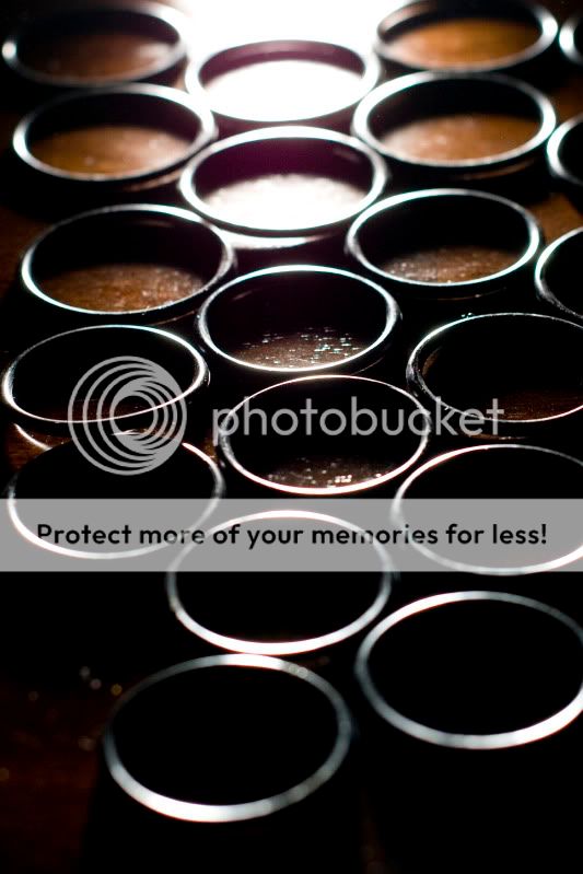
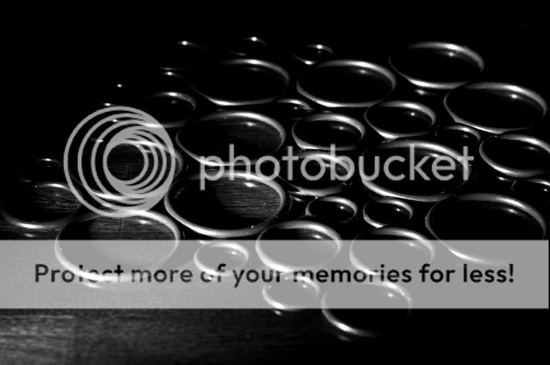
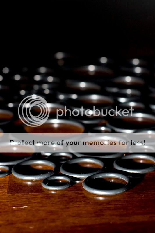
So I've had a little lack of inspiration lately but I thought some rings might be fun, playing around with shadows and such. Please C&C, I appreciate any help you can give. Thanks.

1.
Orings_1449.jpg


2.
Orings_1461.jpg


3.
Orings_1480.jpg


4.
Orings_1490.jpg


5.
Orings_1501.jpg
 
These are very intriguing, that's all I think i can say :lol:

I like 2,3,&4 for all different reasons!
 
I prefer #1.

It's interesting to look at, the highlights and shadows that work in tandem to give you the shape of the rings. I also find the angle and amount to be just right.
 
lol

2 - is like a progression, the top is well lit inside the ring to the bottom that is complete dark inside and the inbetween ones have a transition of light in the middle

3 - same thing only a black and white version with a different horizon and i'm usually a stickler for B&W's

4 - I like how you cansee the light on the left and right side of the rings and you seem to see something "new" with every focus around the picture :)

your turn bitter
 
It's a nice study.

I'd like to see something else in the image. An added point of interest that is either complimentary, or contradictory.

I'd like to see #2 worked out a little better. The light is blown, and bothersome. But I do like the strong light in the back, and the dark foreground. While it goes against the "lights advance, and darks receed", think there is enough highlight on all the rings to bring the viewer to the foreground. It's a great "trick" contradicting perspective, but again, I wish there was something more when I reach the foreground. I would also like to see either more precision in the layout of the rings, or more irregularity, that the other images have.

#4 is another I am drawn to. It's a nice study of pattern and repetition. I don't like the empty space you are led to by the lighting. As a pattern interuption, I wouldn't put it soooo close to the edge.

You could also put some of the smaller rings inside the larger to increase the density of the pattern. Not a critique, just a thought.

What everybody should get out of this, is how effectively light, even just from the highlights, can move your eye through an image. They lack a focal point that you are led to, so there is no "ah hah!" moment. Just more or less of the same.

Sorry to pick on you clbd39. Incomplete thought's aren't helpful to anyone.
To say you like something for "different reasons" gives the OP nothing. It says you do have thoughts about it, but aren't willing to share.
 
Thanks for all of the advice, I really do appreciate all of the help I can get. Anyone else have some C&C?
 
its almost like an optical illusion.some of the rings look joined together.nice shots
 

Most reactions

New Topics

Back
Top