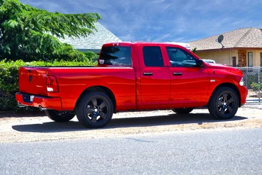
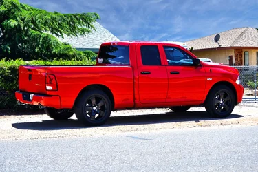
The compositing is a little rough around the tree branches, but otherwise, not too bad. Unfortunately though, it looks at odds with the light on the truck.
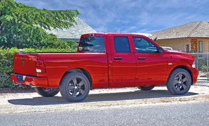
This would be my edit. I cropped the image slightly to get rid of some of the extra pavement. I slightly increased overall image sharpness to give the the truck some more definition. I reduced the highlights to soften up some of the harsh sunlight. I also lightened the shadows a touch to bring out more detail in the tires and darker image areas. I desaturated the colours a bit as they were a bit overwhelming for my taste. I also got rid of the satellite on the roof as it was distracting to me. The only thing I don't agree with here is the sky selection - it tends to make the image look unnatural. The sky looks like a storm is brewing and all objects in the image are illuminated as if there is not a cloud in the sky. A better sky in my opinion would be a clear blue with perhaps a trace of white cloud. This is just my suggestion with what you have.
Thanks for the advice and edit. I like what you have done. The only reason it has that sky is it is my only sky picture I had to swap in to the photo. I like the definition and how you made the truck pop better. I also agree on the over saturatedness of the trees now that I see another example.







![[No title]](/data/xfmg/thumbnail/32/32636-5a159481dcab8aaf87f2d7b501496db1.jpg?1734162122)