grnmnks8u
TPF Noob!
- Joined
- Jan 31, 2014
- Messages
- 69
- Reaction score
- 11
- Location
- california
- Can others edit my Photos
- Photos OK to edit
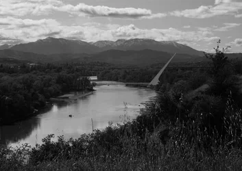
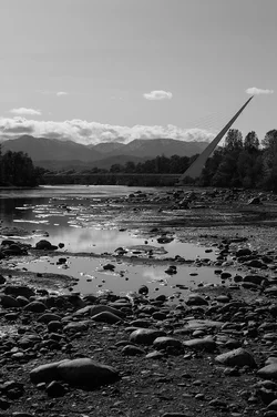
So, again the snow line was abnormally low, so i went out and took some photos of my favorite bridge with the mountains in the back ground, what do you guys think?




![[No title]](/data/xfmg/thumbnail/41/41755-a922f39cc29ff8f6e66a197508bf99f3.jpg?1734176055)
![[No title]](/data/xfmg/thumbnail/42/42274-5bec1b32caba5fed4a680bc5be4d0202.jpg?1734176679)