What's new

Trying my hand at Maternity

ash12783

No longer a newbie, moving up!
Joined
Dec 5, 2012
Messages
104
Reaction score
29
Location
Nacogdoches, TX
Can others edit my Photos
Photos OK to edit
I know there's room for improvement and I'd like to hear what you'd have done differently to make them better. She loved them though so I'm happy about that :)
$brit1.webp$brit2.webp$brit3.webp
I feel like the name could have been a little sharper in the first one- and maybe i should have spaced the letters out more?
In #3 JC is the initials of her significant other :)
 
Not to be a naysayer, but clients will often like the images you give them when they are just decent. Not saying these are just decent (they are not bad actually), but I don't like to lean on what clients say as a measure of good images :)

I like the concept of the name photo. I agree it could of been sharper. I might also of either centered it perfectly in the frame OR moved it more to one side, potentially trying to position the mom so her belly isn't as hidden by the letters. Thats being nitpicky, but an idea none the less.

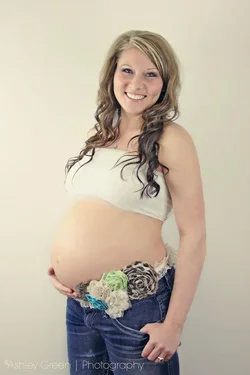
The second image is more of a classic pose. This is where you try and show the belly, the roundness of it. Not sure I'm liking the choice of jeans with the flowers that kind of cut into the shape of the belly. It does add a fun element to the image, a bit more colour that goes well with your processing.

The last image is just standard, nothing really sticks out. Its clean, sure, but doesn't scream maternity. Not like all images have to though, but this is just an ok shot, I prefer the other 2.

Did you make any more? Maybe some closeups on the belly, try and vary the shooting angle to get a little higher and not always straight on. Profile shots can be really nice as well and if you can light it to make a slight silhouette, clients seem to like those. I'm a fan of more serious images, with less smiling. People have said I need to get my model to smile more, so working towards getting a mix of more dramatic / serene moments and funner smiley images.

Have a look at some online shots for inspiration for poses and different things to do. But if you are new to maternity shots, I think you have a great base to start progressing in this type of photography

 
Not to be a naysayer, but clients will often like the images you give them when they are just decent. Not saying these are just decent (they are not bad actually), but I don't like to lean on what clients say as a measure of good images :)

I like the concept of the name photo. I agree it could of been sharper. I might also of either centered it perfectly in the frame OR moved it more to one side, potentially trying to position the mom so her belly isn't as hidden by the letters. Thats being nitpicky, but an idea none the less.

The second image is more of a classic pose. This is where you try and show the belly, the roundness of it. Not sure I'm liking the choice of jeans with the flowers that kind of cut into the shape of the belly. It does add a fun element to the image, a bit more colour that goes well with your processing.

The last image is just standard, nothing really sticks out. Its clean, sure, but doesn't scream maternity. Not like all images have to though, but this is just an ok shot, I prefer the other 2.

Did you make any more? Maybe some closeups on the belly, try and vary the shooting angle to get a little higher and not always straight on. Profile shots can be really nice as well and if you can light it to make a slight silhouette, clients seem to like those. I'm a fan of more serious images, with less smiling. People have said I need to get my model to smile more, so working towards getting a mix of more dramatic / serene moments and funner smiley images.

Have a look at some online shots for inspiration for poses and different things to do. But if you are new to maternity shots, I think you have a great base to start progressing in this type of photography
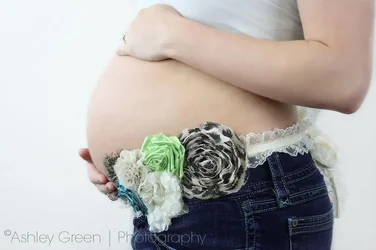
Thank you so much for taking the time to reply and not be too harsh :) I have several more shots but they are at home....she actually had several outfit changes so we got more than just the jeans ;) plus we did shots with the sash under her belly like shown, some midway up, and some at the top of the belly so we could see what we liked better, i really liked it at the top of the belly but I haven't gotten around to editing those yet. Here's a profile pic though and there's something I do care for but I'm not sure what?
$BELLY.webp
 
hmmm... maybe a slight turn of the belly towards the camera might work, adding a bit of depth to it. And the skin tone looks a little off, a little blueish, trying warming that up. :)
Just my thoughts. And don't worry, if I felt the need to be harsh, i would of been. ;)
 
I'd say sell her a nice head & shoulders pic of #3. #1 I personally am not a fan of the in focus object/out of focus subject. I think i would have flipped her so her head was to the right and leffs to the left, then taken the letters and put them on a diagonal that would make like a leading line pointing to her belly and put the entire shot in focus. Leading lines + makes your letters look 3d. but i am in agreement with bigtwinky, the pics are a bit cold
 
Workman-like. I don't mind the KACE shot even though it does appear a bit blurred--the concept is fun!, and #2 is really a cute look at her. The seated shot in #3 is just okay. She's cute. She's pregnant. The exposures look acceptable. Nothing too world-breaking, but OTOH, not anywhere near being horrible either. She looks pretty, happy, and very preggers...for a first go at it, not too bad. I have seen much,much worse, and I have seen better. Yet still...workman-like.
 
I wouldn't shoot maternity square-on from the front (#3). Depending on how they gain, a lot of women don't look all that pregnant from that angle. You can see some distortion in the shirt, but not necessarily in a pregnant way - and even when you actually ARE carrying 20 or 30 extra pounds, even for a good reason, no one wants a photo that makes them look fat.
I like the concept in #1, but not the blurriness of it. Also, her shoulder/upper body kind of seem to be disappearing into the wall behind her.
 
Overall a nice set.

I like the concept in the first - frankly, I like it a TON more than spelling out the name in letter blocks on the belly while mom is lying on her back. I like the choice of the shallow depth of focus, I think that trying to get the name and mom in focus would have created too busy ofan image with the components competing for attention. I do think that this shot is overbalanced to the left, and I don't really like that the 'A' obscures so much of the belly. Lastly, as has been noted about the third shot, shooting the belly straight on isn't the most flattering angle, even when lying down.

The second shot is more standard, but there's a reason for that - it shows off the curve of the baby bump nicely. I like that she's smiling - not how I would shoot it (I like the "serenely looking down at the belly" shot), but I think it really works here. I'm not really a fan of the flowers. Not because they interfere with the belly's lines (the curve against the wall is the important shape, not the belly against the pants), but because the flowers are so busy they pull they eye away from the clean lines of the rest of the image. One thing I would suggest is to use your color pallet to embellish the separation of belly and wall. Her skin tone and the wall color are close enough that the belly curve doesn't jump out at the viewer as much as it would if the background were darker. Oh, and I'd suggest trying to find something for her to do with her hand other than stick it in her pocket - it looks like an afterthought there. Both hands under the belly, cradling it, or one above and one below are common because they help draw both the viewer's focus and the emotional attachment to the belly. Not to say you have to do that, I just think the hand in pocket is too casual and doesn't really fit.

The third one honestly doesn't say maternity to me. Besides being straight on, she's wearing a baggy shirt which further obscures the baby bump shape and comes across as just carrying extra weight.

I can see why she's happy with them, just offering a few things to consider (consider, by no means feel obligated to fall in line) for future shoots.
 
Thank you all so much for your input! You've given me some great advice for the future! One thing I wanted to address is that everyone keeps mentioning the straight on shot, how else could I have done this to showcase the shirt- that was the subject- JC is the father's initials so she wanted to have some pics in that shirt. Any ideas on this would be appreciated :)
 
Maybe spin her 20 degrees or so on the posing stool, so her body and shoulder alignment is similar to that in the second frame...I am pretty confident that the I heart J C would have shown up with some angle to her shoulders. Angled shoulders help to give the subject the impression of 'movement', and also show off the bust, and in this case, would show off the baby bump more. When I saw the I Heart J C, I thought it meant I Love Jesus Christ... Anyway...thanks for the post and for your controlled, normal, grown-up reaction to the C&C's you got.
 
Maybe spin her 20 degrees or so on the posing stool, so her body and shoulder alignment is similar to that in the second frame...I am pretty confident that the I heart J C would have shown up with some angle to her shoulders. Angled shoulders help to give the subject the impression of 'movement', and also show off the bust, and in this case, would show off the baby bump more. When I saw the I Heart J C, I thought it meant I Love Jesus Christ... Anyway...thanks for the post and for your controlled, normal, grown-up reaction to the C&C's you got.
when i tried angling her it just wasn't really working which is why i ended up with this shot :P and thank you for noticing my normal grown-up reaction :) i hate drama and try not to cause it or be in the middle of it- i see some crazy posts on here sometimes though ;)
 
Or simply have her standing with her body positioned the same way. Sitting has a tendency to widen hips and thighs and butt. Standing would make her butt, hips and thighs look thinner and most likely emphasize her belly more. Also she would have to stand up straight. It looks like she is leaning forward. Maybe try standing on a small step ladder on the second rung with her face aimed a foot below your camera but have her eyes look right in the camera. Hands on the top-side and side of her belly. I bet it would work cause JC would be on the top of her belly.
 
I too think a standing pose would work better than the sitting pose for the reasons Qveon mentioned. A few other things I would suggest go back to my point that the shirt is not as form fitting as it could be. One thing you could do is use some binder clips to gather in the shirt from behind. Pull it more snug between the bust and the belly and you will better define the curves of each. Alternatively, since I'm sure this was a custom shirt, you could suggest that she get another, a size smaller and/or of a stretchier material. Not only would it define those curves now it may actually fit her better after the baby is born.
 

Create an account or login to comment

You must be a member in order to leave a comment

Create account

Create an account on our community. It's easy!

Log in

Already have an account? Log in here.

New Topics

Back
Top Bottom